Friday, February 3rd 2012
Xigmatek Gigas Brushed Aluminum Micro-ATX Cube Case Announced
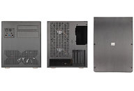
Xigmatek is celebrating a first with the Gigas Micro-ATX Cube, as it is their first Aluminum chassis. Even with its compact dimensions, the Gigas Cube manages to fit high-end Hardware, allowing one to easily build a potent HTPC or Gaming system. USB 3.0, space for up to 4 fans, along with a fan controller round up the list of features.
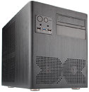
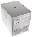
The word "Gigas" is part of the Greek language and means "giant". In the modern language, the prefix "giga" can be found in many different areas to quantify the sheer size. Gigabyte or Gigawatt are such examples and the new chassis from Xigmatek carries the name "Gigas" for good reason.The shell of the cube chassis is constructed of Aluminum, which give the chassis that extraordinary look and feel. With the single piece spanning across the left, front and right of the chassis, completely eliminating any ugly gaps between these areas. Plenty of openings allow for ample ventilation and have been placed in the rear, side and front of the chassis, with the one in the front shaped like an X for Xigmatek.
Two 5.25 inch drive bays in the front next to a perfectly placed I/O panel, which holds not only the power and reset buttons, but also the two USB 2.0 and a single USB 3.0 plug. The latter may be connected directly to the 20-pin header of modern motherboards. Naturally, two status LEDs and a pair of audio connectors can also be found on the I/O panel..
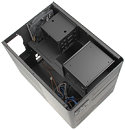
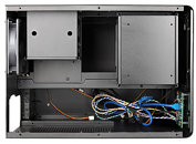
Upon removing the six screws holding the top cover in place, one may access the innovative interior layout, which is the absolute strength of the Gigas. The motherboard, be it of the Micro-ATX or ITX, is simply placed on the floor of the chassis as this panel also acts as the board tray. Expansion cards and ATX power supply are to be installed horizontally within the chassis, as this is the most efficient use of the limited space.
Two large air vents on the left side of the chassis give access to fresh air for the PSU and graphic card so that even the longest (up to 35 cm) and fastest graphic cards keep cool under any circumstance. Two 120 mm fans, rotating at up to 1.000 RPM push cool air across the components, further reducing the overall temperature within the Gigas.
To pull hot air out of the case, the Gigas may hold an additional two 120 mm units in the rear of the chassis. These are to be installed above each other, which generates a healthy flow of air across the hard drive cage and the CPU cooler,
Each of the two hard drive cages can hold up to three 3.5 inch hard drives, with an additional 2.5 inch SSD mounting on the underside of each unit, for a total of eight drives. A third cage, intended for two 5.25 inch drives can be found in the front of the chassis. For additional support of these parts, a metal beam has been installed within the chassis, while still allowing CPU coolers with an impressive height of 18.5 cm to be installed with the Gigas.
With all these features and the incredible and innovative use of space, the Xigmatek Gigas performs like a giant, able to hold high-end components without breaking a sweat. Xigmatek rounds up the impressive list of engineering achievements with their "Mono Cool" fan controller, also part of the Midgard (II) cases, with which one may adjust the speed of up to three fans within the chassis.
The Xigmatek Gigas will be available in black or silver variants at the end of March for a price of 109,90 Euro exclusively at Caseking www.caseking.de.
21 Comments on Xigmatek Gigas Brushed Aluminum Micro-ATX Cube Case Announced
Still huge for a M-ATX case.
I have bookmarked the page for it on Caseking. :D