Thursday, June 5th 2014
Streacom Unveils its First Gaming PC Case
Known more for its elegant SFF and NUC cases, Streacom took a dip into the world of gaming PC cases, with the F12C. It goes with the marketing tagline "elegant, yet powerful chassis for the living room," which tells us that Streacom is targeting that market which puts its gaming-capable PCs in the living room, and that PCs built around this case will make up as good HTPCs as gaming.
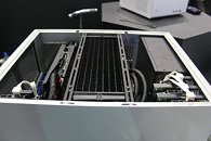
Pictured below, the F12C can seat standard ATX motherboards, with standard ATX PSUs. The case can accommodate graphics cards as long as 300 mm, and reasonably tall CPU coolers. Over the upper half of the motherboard tray are detachable radiator rails, so you can bolt on a 240 x 120 mm radiator. Additional 240 x 120 mm radiators can also be mounted along the case's left-side pair of 120 mm vents, but that would eat into one or more expansion slots. Storage area includes four 3.5-inch, and two 2.5-inch bays. Its cooling system includes two 120 mm vents on each side (one of which on the right side acts as the PSU vent); and two top exhausts (over the radiator rail). There are also passive vents over the rear I/O.
Pictured below, the F12C can seat standard ATX motherboards, with standard ATX PSUs. The case can accommodate graphics cards as long as 300 mm, and reasonably tall CPU coolers. Over the upper half of the motherboard tray are detachable radiator rails, so you can bolt on a 240 x 120 mm radiator. Additional 240 x 120 mm radiators can also be mounted along the case's left-side pair of 120 mm vents, but that would eat into one or more expansion slots. Storage area includes four 3.5-inch, and two 2.5-inch bays. Its cooling system includes two 120 mm vents on each side (one of which on the right side acts as the PSU vent); and two top exhausts (over the radiator rail). There are also passive vents over the rear I/O.


12 Comments on Streacom Unveils its First Gaming PC Case
I wish the dimensions were clear...it's not even on their site yet. I agree, atx vs matx is less appealing than something similar built with the later in mind, in theory, but perhaps it's not practical if you want to fit all typical components anyway. Most full atx this style I've seen are impractically large, where-as with this I frankly DO like the height, and what they've done with that space (Yay, place to put a rad in an htpc)...in my situation it would not hurt at all. The depth appears to be about right for fitting on a typical shelf without overhanging while having space from a wall for plugs, as well as being long enough for a big boy gpu (without excess).
Hmm...something to consider.
That would be a mid size tower if you stood it up
;)