- Joined
- Oct 9, 2007
- Messages
- 47,209 (7.55/day)
- Location
- Hyderabad, India
| System Name | RBMK-1000 |
|---|---|
| Processor | AMD Ryzen 7 5700G |
| Motherboard | ASUS ROG Strix B450-E Gaming |
| Cooling | DeepCool Gammax L240 V2 |
| Memory | 2x 8GB G.Skill Sniper X |
| Video Card(s) | Palit GeForce RTX 2080 SUPER GameRock |
| Storage | Western Digital Black NVMe 512GB |
| Display(s) | BenQ 1440p 60 Hz 27-inch |
| Case | Corsair Carbide 100R |
| Audio Device(s) | ASUS SupremeFX S1220A |
| Power Supply | Cooler Master MWE Gold 650W |
| Mouse | ASUS ROG Strix Impact |
| Keyboard | Gamdias Hermes E2 |
| Software | Windows 11 Pro |
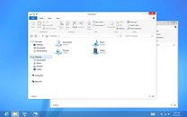
In June, Microsoft will unveil the first Release Preview of Windows 8, its next major version of the Windows (client). Some of the latest screenshots of the teething operating system made it to the web, and reveal some significant changes to the UI, apart from the Metro UI. With its Desktop workspace, Windows 8 embraces a new UI design, that does away with the glassy Aero design that was introduced with Windows Vista. What we have instead, are minimalist titlebars with centered window titles, flat window control buttons, and a blending of the titlebar's color with that of the other menubars. Microsoft justifies the design change by calling the older Aero UI "dated and cheesy." Microsoft assured users that it will assist in the transition between the two UIs, apart from the major change that Metro is.

View at TechPowerUp Main Site

View at TechPowerUp Main Site


