- Joined
- Oct 9, 2007
- Messages
- 47,598 (7.45/day)
- Location
- Dublin, Ireland
| System Name | RBMK-1000 |
|---|---|
| Processor | AMD Ryzen 7 5700G |
| Motherboard | Gigabyte B550 AORUS Elite V2 |
| Cooling | DeepCool Gammax L240 V2 |
| Memory | 2x 16GB DDR4-3200 |
| Video Card(s) | Galax RTX 4070 Ti EX |
| Storage | Samsung 990 1TB |
| Display(s) | BenQ 1440p 60 Hz 27-inch |
| Case | Corsair Carbide 100R |
| Audio Device(s) | ASUS SupremeFX S1220A |
| Power Supply | Cooler Master MWE Gold 650W |
| Mouse | ASUS ROG Strix Impact |
| Keyboard | Gamdias Hermes E2 |
| Software | Windows 11 Pro |
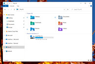
Microsoft is testing a user-interface refresh with an upcoming update to Windows 10. Released for testing with Insider Preview Build 21343, the refresh includes new system icons that are of a significantly different design scheme from the ones you have now. System folders (Desktop, Documents, Downloads, Pictures, Music, etc.,) now come with color-coded icons resembling something from a Windows-knockoff Linux desktop environment. The graphics of the icons appear simpler, and this simplicity probably has something to do with the emergence of remote-desktop/virtual-desktop, where simpler graphics are easier on the network bandwidth, particularly on the side of the VDI server. The current system icons of Windows 10 are evolved from those of previous Windows versions.


View at TechPowerUp Main Site


View at TechPowerUp Main Site


