• Welcome to TechPowerUp Forums, Guest! Please check out our forum guidelines for info related to our community.

Opera Unveils Opera One, an Entirely Redesigned Browser

TheLostSwede

News Editor
Joined
Nov 11, 2004
Messages
17,614 (2.41/day)
Location
Sweden
System Name Overlord Mk MLI
Processor AMD Ryzen 7 7800X3D
Motherboard Gigabyte X670E Aorus Master
Cooling Noctua NH-D15 SE with offsets
Memory 32GB Team T-Create Expert DDR5 6000 MHz @ CL30-34-34-68
Video Card(s) Gainward GeForce RTX 4080 Phantom GS
Storage 1TB Solidigm P44 Pro, 2 TB Corsair MP600 Pro, 2TB Kingston KC3000
Display(s) Acer XV272K LVbmiipruzx 4K@160Hz
Case Fractal Design Torrent Compact
Audio Device(s) Corsair Virtuoso SE
Power Supply be quiet! Pure Power 12 M 850 W
Mouse Logitech G502 Lightspeed
Keyboard Corsair K70 Max
Software Windows 10 Pro
Benchmark Scores https://valid.x86.fr/yfsd9w
Opera is unveiling Opera One today. Opera One is the early access version of a completely redesigned browser that is planned to replace the flagship Opera browser for Windows, MacOS, and Linux later this year. Based on Modular Design, Opera One transforms the way you interact with your browser, delivering a liquid navigation experience which is more intuitive to the user. With today's release, Opera One also becomes the first major Chromium-based browser with a multithreaded compositor that brings the UI to life like never before. Opera One also introduces Tab Islands, a new, more intuitive way of interacting with and managing multiple tabs. This news from the company comes just weeks after announcing its first generative AI features, including AI Prompts, as well as access to ChatGPT and ChatSonic in the sidebar.

Introducing the first implementation of Modular Design
Opera has a history of reinventing itself to address the changing needs of its users as well as the evolving nature of the web. With Opera One, the browser has been redesigned according to Modular Design. The new design philosophy, which is being presented today for the first time, will allow Opera to over time build a more powerful and feature-rich browser that is ready for a generative AI-based future. The Opera browser is thus beginning its metamorphosis into a browser that will dynamically adapt to the user's needs by bringing only the key features to the foreground: the relevant modules within Opera One will adjust automatically based on context, providing the user with a more liquid and effortless browsing experience.
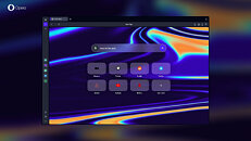


As opposed to adding more and more features and highlighting them, every element in Opera One has been closely evaluated for relevance. As a result, the browser has a cleaner, decluttered look with plenty of space for future AI-based features and extensions in both the browser sidebar and address bar. With Opera One, ChatGPT, ChatSonic and the new AI Prompts feature are switched on by default.

Beyond creating space for existing generative AI services, the new design is also laying the groundwork for the AI services Opera is planning to unveil in the near future.

First major browser with Multithreaded Compositor for super smooth UI experience
The power of the web has been continuously growing, enabling high performance graphics operations on websites without interruptions by other processes. With Opera One, Opera is introducing a similar approach to the browser user interface, implementing a new multithreaded compositor to deliver a faster and smoother user interface layer. With the Multithreaded Compositor, Opera One is the first major Chromium-based browser that brings its UI to life like never before. Combined with the new Modular Design Principles, this new architecture enables the implementation of new features and allows Opera to continue its differentiation from other Chromium-based browsers. One of the new features made possible by the improved browser architecture is Tab Islands.

Tab Islands: a new, intuitive way of interacting with tabs
Tab Islands is a new feature that delivers a smooth and intuitive experience built for users that interact with many tabs.

Researchers have found that the existing tab design in browsers makes it difficult to jump between sets of tasks. Moreover, according to Opera's research, the majority of people feel overwhelmed by how messy their tabs get and wish web browsers would do more to help them manage their tabs.

Opera One's new Tab Islands address this challenge. Tab Islands are a new way of keeping tabs that are related to each other together in an intuitive way - without forcing users to change their habits. Are you looking for the best lunch restaurant? The tabs with the menus, locations, and restaurant details will open in a dedicated tab island. Do you have a bunch of Google Docs you use for work? They, too, can get a tab island of their own. As you browse and more tab islands are created, you can easily distinguish the topics you were focusing on and switch between them. In the new, reinvented version of Opera, Tab Islands are the first manifestation of its Modular Design: they are clearly distinguishable in the browser UI, marked by separate colors and clear island borders.

"Tab Islands are a natural way of arranging your tabs into contextual groups without disturbing your flow. They make it easy to keep tabs that relate to each other in groups that you can open and collapse as needed. This makes browsing with many tabs more efficient, allowing for a more pleasant, liquid browsing experience," said Joanna Czajka, product director at Opera.

Tab islands are automatically created to keep the tabs together within the same browsing context. Open websites can also be gathered into a tab island by pressing the CTRL/Command button and clicking on the ones you want to group and then right clicking to create a tab island. They can also be moved by dragging and dropping between islands. You can also add to an existing tab island by drag and drop or by pressing the small plus button on the side of the island.

Popular AI features in the sidebar
Opera's updates in early 2023 that included the addition of generative AI features into the browser have paved the way for this new, redesigned browser. In the future, Opera will morph to become fully modular, making the browser UI more intuitive and functional.

"Opera One is the first instance of our smart, modular design within Opera. It marks the beginning of a chain of innovation, including Opera's own AI engine to be shipped in the coming months. The web just got smarter and faster with generative AI. With Opera One, we are ready to embrace and lead that change," added Czajka.


View at TechPowerUp Main Site | Source
 
Joined
Dec 12, 2016
Messages
1,840 (0.63/day)
Sigh…it doesn’t look any different than any other browser. I believe its high time to rethink the internet itself. Not change the color of the window that allows us to look at the internet.

The internet use to be called the World Wide Web. We should lean into that web metaphor again.

Edit: a www browser should be a globe of the world with all information geolocated. There should be tons of customizable layers based on what interests you. Real time weather layer, locations of game developer HQs that are clickable for getting game info, sports arenas where you can zoom in and watch a game playing in real time, etc.

The WWW should be a massive global interactive map that can be experienced on 2D desktops and in 3D virtual reality. Seamless switching between the two can add another feature rich interaction space.

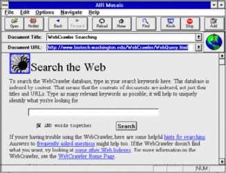
Edit 2: I mean is there really a big difference from this:
1682423865626.gif

To this:
B79F09B3-093E-4415-B527-1EEB0F034F05.jpeg
Other than a fresh coat of paint.
 

Attachments

  • 1682423783463.gif
    1682423783463.gif
    72.5 KB · Views: 50
  • 1682423878058.gif
    1682423878058.gif
    72.5 KB · Views: 40
Last edited:
Joined
Jan 28, 2019
Messages
35 (0.02/day)
Processor AMD Ryzen Threadripper 3970X
Motherboard ASRock TRX40 Creator
Cooling NH-U14S TR4-SP3
Memory G.SKILL Trident Z RGB 3200MHz 8x8GB
Video Card(s) RTX A6000
Storage WD SN850
Power Supply 1000W EVGA SuperNova P2
I've been using Opera GX on all of my PCs. After you remove the bloat/unwanted widgets and gamery stuff it's a solid, fast browser. I love the fact that you can set a hard limit for RAM/CPU usage.
 
Joined
Sep 15, 2015
Messages
1,074 (0.32/day)
Location
Latvija
System Name Fujitsu Siemens, HP Workstation
Processor Athlon x2 5000+ 3.1GHz, i5 2400
Motherboard Asus
Memory 4GB Samsung
Video Card(s) rx 460 4gb
Storage 750 Evo 250 +2tb
Display(s) Asus 1680x1050 4K HDR
Audio Device(s) Pioneer
Power Supply 430W
Mouse Acme
Keyboard Trust
Chat gpt need acoint.
 

bug

Joined
May 22, 2015
Messages
13,761 (3.96/day)
Processor Intel i5-12600k
Motherboard Asus H670 TUF
Cooling Arctic Freezer 34
Memory 2x16GB DDR4 3600 G.Skill Ripjaws V
Video Card(s) EVGA GTX 1060 SC
Storage 500GB Samsung 970 EVO, 500GB Samsung 850 EVO, 1TB Crucial MX300 and 2TB Crucial MX500
Display(s) Dell U3219Q + HP ZR24w
Case Raijintek Thetis
Audio Device(s) Audioquest Dragonfly Red :D
Power Supply Seasonic 620W M12
Mouse Logitech G502 Proteus Core
Keyboard G.Skill KM780R
Software Arch Linux + Win10
I'm using Vivaldi. It had tab grouping for ages (on two levels, no less). On top of that, last week it gained "workspaces" - instantly change all the tabs in the current window.
It's not open source (still Chromium based, so most bits are already out there), so a bit of a hassle to install on some Linux distros. But otherwise it works a treat.
 
Joined
Aug 21, 2015
Messages
1,723 (0.51/day)
Location
North Dakota
System Name Office
Processor Ryzen 5600G
Motherboard ASUS B450M-A II
Cooling be quiet! Shadow Rock LP
Memory 16GB Patriot Viper Steel DDR4-3200
Video Card(s) Gigabyte RX 5600 XT
Storage PNY CS1030 250GB, Crucial MX500 2TB
Display(s) Dell S2719DGF
Case Fractal Define 7 Compact
Power Supply EVGA 550 G3
Mouse Logitech M705 Marthon
Keyboard Logitech G410
Software Windows 10 Pro 22H2
Still using Chromium. Pass.

Sigh…it doesn’t look any different than any other browser. I believe its high time to rethink the internet itself. Not change the color of the window that allows us to look at the internet.

Why does the look matter? That's like complaining about monitor or TV styling. Those all look the same now because we realized that what matters is what's being presented, not what the thing doing the presenting looks like.

The internet use to be called the World Wide Web. We should lean into that web metaphor again.

Except that was wrong. The WWW is one slice of the Internet. People just called it the Internet because it was the part most people most directly interacted with.

Edit: a www browser should be a globe of the world with all information geolocated. There should be tons of customizable layers based on what interests you. Real time weather layer, locations of game developer HQs that are clickable for getting game info, sports arenas where you can zoom in and watch a game playing in real time, etc.

The WWW should be a massive global interactive map that can be experienced on 2D desktops and in 3D virtual reality. Seamless switching between the two can add another feature rich interaction space.

Can't say I'm particularly interested in a Web that complex. What you're describing is, to me, a hyper-advanced version of AOL or other early portal services. Meta is trying what I think you're describing now, and so far interest has been... tepid.

Edit 2: I mean is there really a big difference from this:
View attachment 293030
To this:
View attachment 293032 Other than a fresh coat of paint.

No, and maybe that's fine. Or maybe it's a question of the concept not having been presented in the right way yet.
 
Joined
Jul 7, 2019
Messages
916 (0.47/day)
I guess it's just me, but I'm sick and tired of all the "Modern UI" elements going for curved corners and "bubble"-like icons. I guess a large part of it is driven by a focus on touch-compatibility (esp. with Win11), but I really hope there's an option for a more traditional, box-style set of iconography and UI elements.
 
Joined
Apr 22, 2021
Messages
249 (0.19/day)
A new way to "tab our usage" always-listening/phoning home huh and no mention of any added security, etc.?

Hmm...
 
Joined
Nov 11, 2005
Messages
42 (0.01/day)
the original developers exited this company and make Vivaldi
then chinese company with shady advertising and fraud past got control of significant part of Opera company share
what is the point of using browser where you can't trust it's safe
 
Joined
Jun 21, 2021
Messages
3,121 (2.49/day)
System Name daily driver Mac mini M2 Pro
Processor Apple proprietary M2 Pro (6 p-cores, 4 e-cores)
Motherboard Apple proprietary
Cooling Apple proprietary
Memory Apple proprietary 16GB LPDDR5 unified memory
Video Card(s) Apple proprietary M2 Pro (16-core GPU)
Storage Apple proprietary onboard 512GB SSD + various external HDDs
Display(s) LG UltraFine 27UL850W (4K@60Hz IPS)
Case Apple proprietary
Audio Device(s) Apple proprietary
Power Supply Apple proprietary
Mouse Apple Magic Trackpad 2
Keyboard Keychron K1 tenkeyless (Gateron Reds)
VR HMD Oculus Rift S (hosted on a different PC)
Software macOS Sonoma 14.7
Benchmark Scores (My Windows daily driver is a Beelink Mini S12 Pro. I'm not interested in benchmarking.)
Sigh…it doesn’t look any different than any other browser. I believe its high time to rethink the internet itself. Not change the color of the window that allows us to look at the internet.

The internet use to be called the World Wide Web. We should lean into that web metaphor again.

Edit: a www browser should be a globe of the world with all information geolocated. There should be tons of customizable layers based on what interests you. Real time weather layer, locations of game developer HQs that are clickable for getting game info, sports arenas where you can zoom in and watch a game playing in real time, etc.

The WWW should be a massive global interactive map that can be experienced on 2D desktops and in 3D virtual reality. Seamless switching between the two can add another feature rich interaction space.

The web community tried this and it failed. VRML, X3D, Second Life, etc.

There are probably a couple dozen major factors that influenced this but for sure the commercialization of the Internet was one of the major influences.

Now the (legal acceptable) Internet is all about corporations and their products and services. This was not the case during the Nineties.

Even Zuckerberg's lofty Metaverse dream appears to be DOA in its current form. I think part of that is consumer pushback; some people don't want to live their online lives completely controlled by Meta/FB.

There's also the notion of some concepts not fitting into the Planet Earth framework. What about subjects like Linux system administration, Star Wars, or gardening? Where should web pages on the Early Girl tomato cultivar live on virtual Planet Earth? Or fan schematics of R2-D2?

I do think the Internet should be something more than just a bunch of companies and their revenue generating activities. However the consumer climate in 2023 seems to lean toward pure monetization. And Generation Z is being indoctrinated at a very early age that being online is directly related to monetizable value, whether it be microtransactions in videogames or social media views (such as "likes" on TikTok).

People who are familiar with the World Wide Web in the Nineties have a greater understanding of what the Internet once was, its missed opportunities, and ultimately the acceptance that today's Internet audience doesn't seem to care about an expansive universe.

Hell, a lot of today's Internet users are now too lazy to even use a search engine when appropriate or time expedient.

Going back to the original topic, this is window dressing on a Chinese owned web browser. Ultimately it will do what is in the best interests of China the civilization. That's what the Chinese do and it's why it is one of the oldest enduring civilizations. When the time for humans nears its end, China will be there.
 
Last edited:
Joined
Jun 16, 2021
Messages
149 (0.12/day)
Edit: a www browser should be a globe of the world with all information geolocated. There should be tons of customizable layers based on what interests you. Real time weather layer, locations of game developer HQs that are clickable for getting game info, sports arenas where you can zoom in and watch a game playing in real time, etc.

The WWW should be a massive global interactive map that can be experienced on 2D desktops and in 3D virtual reality. Seamless switching between the two can add another feature rich interaction space.

Well, what you describe is just a different way of data presentation. Beneath that, "internet" will function the same way as today, with bunch of hyperlinks moving you around.

And it does not have any connection to browser - it is not something that browser could do.

But it is interesting business idea - next gen of Wikipedia, maybe? It could be very interesting, albeit quite hard to achieve.

the original developers exited this company and make Vivaldi
then chinese company with shady advertising and fraud past got control of significant part of Opera company share
what is the point of using browser where you can't trust it's safe
And how is that different than any Chromium browser on the market? Google is for sure not trustworthy...
A new way to "tab our usage" always-listening/phoning home huh and no mention of any added security, etc.?

Hmm...
Mhm, Chromium at its finest.

I do think the Internet should be something more than just a bunch of companies and their revenue generating activities. However the consumer climate in 2023 seems to lean toward pure monetization. And Generation Z is being indoctrinated at a very early age that being online is directly related to monetizable value, whether it be microtransactions in videogames or social media views (such as "likes" on TikTok).

People who are familiar with the World Wide Web in the Nineties have a greater understanding of what the Internet once was, its missed opportunities, and ultimately the acceptance that today's Internet audience doesn't seem to care about an expansive universe.

Hell, a lot of today's Internet users are now too lazy to even use a search engine when appropriate or time expedient.

Exactly. I couldn't agree more. I think that the Internet these days is just a bland shadow of what it was during the 90s and early 00s. And it is so over-commercialized that it is painful to watch.

Also, what is the point of using search engines, when 99% of them are just there to sell you more commercialized content?

Going back to the original topic, this is window dressing on a Chinese owned web browser. Ultimately it will do what is in the best interests of China the civilization. That's what the Chinese do and it's why it is one of the oldest enduring civilizations. When the time for humans nears its end, China will be there.
Chrome is windows-dressing over a US owned browser. And so on, so on... Same can be said for any browser...
 
Last edited:
Joined
Jun 21, 2021
Messages
3,121 (2.49/day)
System Name daily driver Mac mini M2 Pro
Processor Apple proprietary M2 Pro (6 p-cores, 4 e-cores)
Motherboard Apple proprietary
Cooling Apple proprietary
Memory Apple proprietary 16GB LPDDR5 unified memory
Video Card(s) Apple proprietary M2 Pro (16-core GPU)
Storage Apple proprietary onboard 512GB SSD + various external HDDs
Display(s) LG UltraFine 27UL850W (4K@60Hz IPS)
Case Apple proprietary
Audio Device(s) Apple proprietary
Power Supply Apple proprietary
Mouse Apple Magic Trackpad 2
Keyboard Keychron K1 tenkeyless (Gateron Reds)
VR HMD Oculus Rift S (hosted on a different PC)
Software macOS Sonoma 14.7
Benchmark Scores (My Windows daily driver is a Beelink Mini S12 Pro. I'm not interested in benchmarking.)
Exactly. I couldn't agree more. I think that the Internet these days is just a bland shadow of what it was during the 90s and early 00s. And it is so over-commercialized that it is painful to watch.

Also, what is the point of using search engines, when 99% of them are just there to sell you more commercialized content?

Let's not forget that the search engine emerged to replace the web directory (what Yahoo was originally) because the latter does not scale well.

There are less commercialized search engines like DuckDuckGo and Startpage today and defunct ones like Altavista (RIP).

And using a search engine does not excuse the viewer from using their brain in interpreting the search results. Unfortunately an increasingly large percentage of Internet users don't seem to understand this.

In my (unpopular) opinion, the Internet peaked around 2006 or 2007. Smartphones have brought the swift decline of the Internet.

Steve Jobs referred to the iPhone as "the computer for the rest of us." He was eerily correct. Putting a computer in everyone's hands for all of their waking hours has caused more problems than it has solved.

Giving everyone a voice all hours of the day every day of the year has not made the Internet a better place. It just created more noise.

The world doesn't need a "better web browser." It needs to push back from the computer, periodically put their smartphone in airplane mode, and keep it in a pocket. Smart watches are accelerating the Internet's decline as well; I think their health tracking features are astounding but their constant connectivity is not a good thing for most users.

I've been spending less time here at TPU over the past few months. But not just this site but the Internet in general. I'm better off spending a large chunk of my day away from the Internet. It's always there if I need to solve a problem or researching something. But in 2023, the Internet is a sh!tty place to hang out. Most of it is an online ghetto and many formerly community focused places are seeing significant degradation in overall user experience.

But that's the Internet in 2023. People have turned it into what they want it to be. And by giving everyone a voice in the matter has turned the Web into the lowest common denominator. Diverse but not focused toward quality.
 
Last edited:
Joined
Jun 16, 2021
Messages
149 (0.12/day)
Let's not forget that the search engine emerged to replace the web directory (what Yahoo was originally) because the latter does not scale well.

There are less commercialized search engines like DuckDuckGo and Startpage today and defunct ones like Altavista (RIP).

And using a search engine does not excuse the viewer from using their brain in interpreting the search results. Unfortunately an increasingly large percentage of Internet users don't seem to understand this.

In my (unpopular) opinion, the Internet peaked around 2006 or 2007. Smartphones have brought the swift decline of the Internet.

Steve Jobs referred to the iPhone as "the computer for the rest of us." He was eerily correct. Putting a computer in everyone's hands for all of their waking hours has caused more problems than it has solved.

Giving everyone a voice all hours of the day every day of the year has not made the Internet a better place. It just created more noise.

The world doesn't need a "better web browser." It needs to push back from the computer, periodically put their smartphone in airplane mode, and keep it in a pocket. Smart watches are accelerating the Internet's decline as well; I think their health tracking features are astounding but their constant connectivity is not a good thing for most users.

I've been spending less time here at TPU over the past few months. But not just this site but the Internet in general. I'm better off spending a large chunk of my day away from the Internet. It's always there if I need to solve a problem or researching something. But in 2023, the Internet is a sh!tty place to hang out. Most of it is an online ghetto and many formerly community focused places are seeing significant degradation in overall user experience.

But that's the Internet in 2023. People have turned it into what they want it to be. And by giving everyone a voice in the matter has turned the Web into the lowest common denominator. Diverse but not focused toward quality.
Well, you presented current situation so nicely that I am going to cite you in future quite a lot. Online ghetto - that is fantastic summary of internet state in just two words. I never had talent for such concise, yet precise presentation :) Thanks!
 

Ephebus

New Member
Joined
Mar 13, 2022
Messages
3 (0.00/day)
I guess it's just me, but I'm sick and tired of all the "Modern UI" elements going for curved corners and "bubble"-like icons. I guess a large part of it is driven by a focus on touch-compatibility (esp. with Win11), but I really hope there's an option for a more traditional, box-style set of iconography and UI elements.

It;s not just you... :)
 

Wye

Joined
Feb 15, 2023
Messages
204 (0.31/day)
"One", "Island".
C'mon guys, stop copying Apple, it's getting ridiculous.
Have the balls to come up with your own design and naming, or you're going to be a beta forever.
 
Joined
Jan 31, 2010
Messages
5,543 (1.02/day)
Location
Gougeland (NZ)
System Name Cumquat 2021
Processor AMD RyZen R7 7800X3D
Motherboard Asus Strix X670E - E Gaming WIFI
Cooling Deep Cool LT720 + CM MasterGel Pro TP + Lian Li Uni Fan V2
Memory 32GB GSkill Trident Z5 Neo 6000
Video Card(s) Sapphire Nitro+ OC RX6800 16GB DDR6 2270Cclk / 2010Mclk
Storage 1x Adata SX8200PRO NVMe 1TB gen3 x4 1X Samsung 980 Pro NVMe Gen 4 x4 1TB, 12TB of HDD Storage
Display(s) AOC 24G2 IPS 144Hz FreeSync Premium 1920x1080p
Case Lian Li O11D XL ROG edition
Audio Device(s) RX6800 via HDMI + Pioneer VSX-531 amp Technics 100W 5.1 Speaker set
Power Supply EVGA 1000W G5 Gold
Mouse Logitech G502 Proteus Core Wired
Keyboard Logitech G915 Wireless
Software Windows 11 X64 PRO (build 23H2)
Benchmark Scores it sucks even more less now ;)
Vivaldi FTW Opera is but a poor copy of what it once was and now it'a a poor copy owned by china yeah nah I'll stick to Vivaldi thanks
 
Top