- Joined
- May 21, 2024
- Messages
- 1,088 (3.53/day)
Sandisk Corporation today previewed its new corporate branding and creative direction, signaling a bold debut of the company's comeback launch as a standalone Flash and memory technology innovator, planned for early 2025.
Defined by a 'Mindset of Motion', Sandisk's new creative direction represents a future forward philosophy where by creating paths and possibilities for people to go without limits, the company unites the current moment and their aspirations. This mindset brings people closer to their ambitions and creates a circle of collaboration for progress and future growth.

The Sandisk wordmark represents a heritage of mobility and versatility that enables a seamless and simplified world of resilient data expression and storage. The company's innovation keeps aspirations moving and pushes possibility forward, empowering people and businesses with data everywhere.
Sandisk Brand Mark Design Attributes
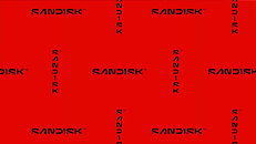
From a pixel to a platform for ambition, the new Sandisk mark is engineered to embody innovation. The logo's clean lines and minimalist design mirror the speed and efficiency of Flash technology. The iconic open D letterform unites with a fresh, pixel-driven S, both symbolizing collaboration and partnership, shaping the future of technology. With both vertical and horizontal representations, the mark defies limitation.
View at TechPowerUp Main Site | Source
Defined by a 'Mindset of Motion', Sandisk's new creative direction represents a future forward philosophy where by creating paths and possibilities for people to go without limits, the company unites the current moment and their aspirations. This mindset brings people closer to their ambitions and creates a circle of collaboration for progress and future growth.

The Sandisk wordmark represents a heritage of mobility and versatility that enables a seamless and simplified world of resilient data expression and storage. The company's innovation keeps aspirations moving and pushes possibility forward, empowering people and businesses with data everywhere.
"Enabling people to experience the potential of their data and move forward in making aspirations real is at the heart of what we do and we were very intentional in creating a mark that embodies the spirit of this thinking," said Joel Davis, vice president of Creative, Sandisk. "Our visual brand philosophy is inspired by the future and all the diverse ways our customers consume data. Starting with a single pixel, the new Sandisk mark uses bold visual language while being rooted in the idea that progress is not an end point but a way of being."
Sandisk Brand Mark Design Attributes
From a pixel to a platform for ambition, the new Sandisk mark is engineered to embody innovation. The logo's clean lines and minimalist design mirror the speed and efficiency of Flash technology. The iconic open D letterform unites with a fresh, pixel-driven S, both symbolizing collaboration and partnership, shaping the future of technology. With both vertical and horizontal representations, the mark defies limitation.
View at TechPowerUp Main Site | Source


