- Joined
- Aug 19, 2017
- Messages
- 2,703 (1.00/day)
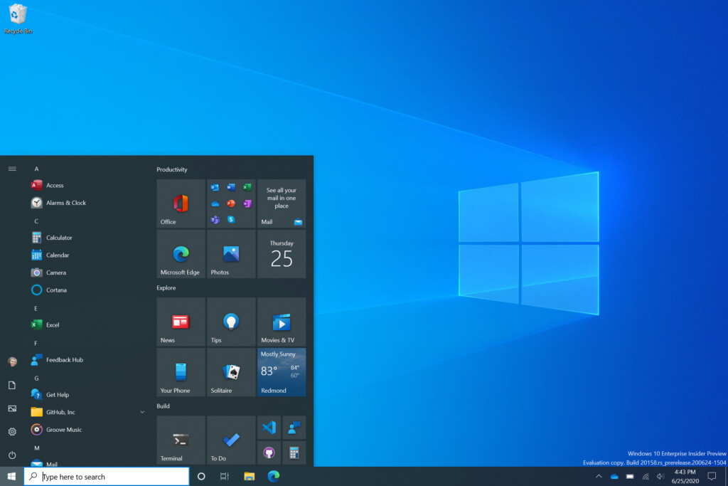
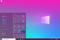
Microsoft is giving the Windows 10 OS some finishing touches still, as a lot of UI is slowly changing over time. For example, just a few months back we have received a new icon pack that brought the material design to Windows 10 icons. However, now Microsoft is going even further in its mission to blend UI elements and give users the best possible viewing pleasure. This time, Microsoft is giving the start menu an overhaul. "We are freshening up the Start menu with a more streamlined design that removes the solid color backplates behind the logos in the apps list and applies a uniform, partially transparent background to the tiles. This design creates a beautiful stage for your apps, especially the Fluent Design icons for Office and Microsoft Edge, as well as the redesigned icons for built-in apps like Calculator, Mail, and Calendar that we started rolling out earlier this year."
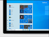
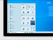
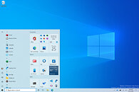
It is available in Windows 10 Insider Preview Build 20161 and should come to mainstream later on. If you want to splash a bit of color (see images below) you can apply that theme by going to Settings > Personalization > Color, then toggle the "Show accent color on the following surfaces" for "Start, taskbar, and action center". Below, you can check before and after comparison between old and new designs, along with the new color theme.

View at TechPowerUp Main Site
It is available in Windows 10 Insider Preview Build 20161 and should come to mainstream later on. If you want to splash a bit of color (see images below) you can apply that theme by going to Settings > Personalization > Color, then toggle the "Show accent color on the following surfaces" for "Start, taskbar, and action center". Below, you can check before and after comparison between old and new designs, along with the new color theme.


View at TechPowerUp Main Site


