- Joined
- Oct 9, 2007
- Messages
- 47,598 (7.45/day)
- Location
- Dublin, Ireland
| System Name | RBMK-1000 |
|---|---|
| Processor | AMD Ryzen 7 5700G |
| Motherboard | Gigabyte B550 AORUS Elite V2 |
| Cooling | DeepCool Gammax L240 V2 |
| Memory | 2x 16GB DDR4-3200 |
| Video Card(s) | Galax RTX 4070 Ti EX |
| Storage | Samsung 990 1TB |
| Display(s) | BenQ 1440p 60 Hz 27-inch |
| Case | Corsair Carbide 100R |
| Audio Device(s) | ASUS SupremeFX S1220A |
| Power Supply | Cooler Master MWE Gold 650W |
| Mouse | ASUS ROG Strix Impact |
| Keyboard | Gamdias Hermes E2 |
| Software | Windows 11 Pro |
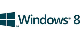
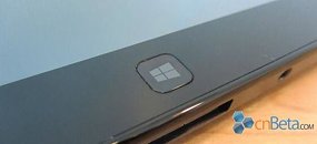
The waving flag logo of Microsoft's Windows trademark has reportedly undergone a facelift to keep up with the radically new user interface called "Metro". The new logo will take effect with the next major version of Windows. Metro is Microsoft's most drastic user interface change since Windows 95, and consists of organizing interactive information (smart application shortcuts, gadgets, images, and slideshows), in rectangular slices of the screen-space. The Windows flag logo is redesigned to reflect this change, it's now flat, angled, with all four rectangles in the same plane. CNBeta scored a 1-color version of the logo, and made mock-ups of what it could look like on devices (such as tablets and keyboards).


View at TechPowerUp Main Site


View at TechPowerUp Main Site


 Windows using a flag why did they call it windows and not flag, looks like they change the flag to windows now i think it abit late for that dont you


