 5
5
CM Storm Quick Fire XTi Gaming Keyboard Review
Performance »The Package
CM Storm ships the Quick Fire XTi in a box with its usual flashy styling.
You will find the keyboard, a removable cable, and a key-cap remover inside the box. The bundle is pretty slim as there are no special key caps like those we've seen with quite a few higher-end gaming keyboards or a wrist rest.
The cable system on CM Storm's Quick Fire keyboards has always been a bit of a mess. The micro USB plug is almost impossible to insert into the small cavity on the keyboard's back plate. Fortunately, there are ample strain reliefs on the Quick Fire XTi to prevent any cable from being pulled, which could ruin the micro USB plug.
Closer Examination
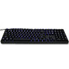
The XTi version of the fully sized Quick Fire keyboard looks pretty sleek. It is all-black with no big logos on the front. The only prominent design detail is the all-matte finish on its key caps and the chassis.
On the back of the keyboad are the usual stands which allows you to incline the keyboard. The stands only have one setting and feature big rubber feet that are quite effective.
Color control on the Quick Fire XTi is limited to a mixture of red and blue. These are perhaps the two most-used colors for keyboards with fixed colored back-lighting. The system is quite simple as you get five choices of each you can mix and match, which gives you colors that range from red to purple and blue. There are multiple lighting modes, and you can tweak them by using the controls on the keyboard as the XTi is completely driverless.
CM Storm is sticking to Cherry MX keys for the XTi despite messing around with the Novatouch key-mechanisms on other designs. The keyboard we got for testing features MX Browns, which are a good compromise between gaming and typing performance for those who appreciate very low typing fatigue and do not need double-tapping precision.
You will find the profile-selector keys above the numpad area. The four P-keys allow you to change profiles on the fly as everything is stored in the keyboard.
The lighting system allows you to do custom illumination on a per-key basis, which is pretty neat if you need to highlight a certain group or just one key for a certain game or event.
CM Storm uses a standard layout, which is a good decision. There are no extra keys besides the profile-control buttons above the numpad.
Apr 10th, 2025 08:14 EDT
change timezone
Latest GPU Drivers
New Forum Posts
- Do you use Linux? (574)
- Asking before I mess up (19)
- Can you guess Which game it is? (66)
- Downgrading bios on asrock A320 board (4)
- TPU's Nostalgic Hardware Club (20215)
- Looking for input on fan placement for my Define R5 (10)
- Your PC ATM (35330)
- TechPowerUp RAM Latency Calculator Feedback (71)
- Problem "Vu meter Windows 11 24h2 missing" (2)
- Thermal testing two different size Gigabyte 5070 Ti cards - huge differences (20)
Popular Reviews
- The Last Of Us Part 2 Performance Benchmark Review - 30 GPUs Compared
- ASRock Z890 Taichi OCF Review
- MCHOSE L7 Pro Review
- Sapphire Radeon RX 9070 XT Pulse Review
- PowerColor Radeon RX 9070 Hellhound Review
- Upcoming Hardware Launches 2025 (Updated Apr 2025)
- Sapphire Radeon RX 9070 XT Nitro+ Review - Beating NVIDIA
- Acer Predator GM9000 2 TB Review
- ASUS GeForce RTX 5080 Astral OC Review
- Zotac GeForce RTX 5070 Ti Amp Extreme Review
Controversial News Posts
- NVIDIA GeForce RTX 5060 Ti 16 GB SKU Likely Launching at $499, According to Supply Chain Leak (174)
- MSI Doesn't Plan Radeon RX 9000 Series GPUs, Skips AMD RDNA 4 Generation Entirely (146)
- Microsoft Introduces Copilot for Gaming (124)
- AMD Radeon RX 9070 XT Reportedly Outperforms RTX 5080 Through Undervolting (119)
- NVIDIA Reportedly Prepares GeForce RTX 5060 and RTX 5060 Ti Unveil Tomorrow (115)
- Nintendo Confirms That Switch 2 Joy-Cons Will Not Utilize Hall Effect Stick Technology (100)
- Over 200,000 Sold Radeon RX 9070 and RX 9070 XT GPUs? AMD Says No Number was Given (100)
- Nintendo Switch 2 Launches June 5 at $449.99 with New Hardware and Games (99)


