 6
6
FSP M580 Plus Review
A Closer Look - Inside »A Closer Look - Outside
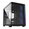
As soon as you unpack the case, your attention will be drawn to the curved glass panel, as the FSP M580 Plus uses a single pane of the material to wrap around two sides of the body. The bend radius is one of the tightest we have seen and seeing a case of this price segment sport this feature is unique. We have come a long way from gently bent glass on $400-500 cases, to it becoming a mainstream staple.
Looking at the front, the FSP M580 Plus design is pretty straightforward with the curve on the right side of the case mirroring that of the glass for a symmetrical look. It is not apparent, but there is also an ARGB strip embedded in the gap between the glass front panel there. In the rear, the case offers some insights into the overall layout, with the PSU and storage hidden behind the upright motherboard tray.
FSP has tinted the glass a little bit, but it is still clear enough so that you will be able to see your components nicely, especially with some ARGB illumination. The whole glass panel is actually held in place with push pins on the front, rails on the side and then secured to stay there with a single thumb screw on the underside of the case. The result is a clean implementation without any visible mounting elements. On the opposite side, the metal panel sports two finely perforated areas to allow for fresh air intake for the side mounted fans and PSU.
Taking a closer look at the rear, the FSP M580 Plus provides the usual seven expansion slots with individual, reusable covers that are held in place with normal screws. A little cover next to it also closes the gap since these screws are located on the exterior of the case. Above that, you will find one of four pre-installed fans, with this one set to blow air out the back of the chassis. There also seems to be plenty of space above it, so that should be able to accommodate an AIO in the ceiling without issue. In the left top corner FSP has placed the PSU bay, with a single set of mounting holes, which means that the unit's intake fan will face outward, drawing in that cool air though the perforated side panel.
At the top, you will find a magnetic mesh cover, which keeps larger debris out of the interior of the chassis. Beneath it, you may mount three 120 or two 140 mm fans, or a radiator of up to 360 mm in size. The M580 Plus also includes a fully fledged, uncompromising I/O setup, with the two black USB-A and USB-C ports alongside that pair of audio connectors. Thanks to the dedicated LED button, you also get to retain the use of the reset switch, which is nice.
On the underside, there is another magnetic mesh cover. While this will function fine, FSP should have really designed this as a tray to be pulled out through the back or ideally front of the case instead. From this angle, you can also see the single screw securing the glass panel in its position. It can easily be reached even without tipping over the case.
May 6th, 2025 12:52 EDT
change timezone
Latest GPU Drivers
New Forum Posts
- Half Life 3 soon ? (30)
- The TPU UK Clubhouse (26211)
- Is RX 9070 VRAM temperature regular value or hotspot? (378)
- RX 9000 series GPU Owners Club (667)
- I dont understand the phone OS world..... (209)
- Pc crash (10)
- What local LLM-s you use? (175)
- Vertical mice in gaming (34)
- Kindly help in Identifying GPU and Suitable bios (29)
- AAF Optimus Modded Driver For Windows 10 & Windows 11 - Only for Realtek HDAUDIO Chips (469)
Popular Reviews
- Arctic Liquid Freezer III Pro 360 A-RGB Review
- ASUS Radeon RX 9070 XT TUF OC Review
- Clair Obscur: Expedition 33 Performance Benchmark Review - 33 GPUs Tested
- ASUS ROG Maximus Z890 Hero Review
- Zotac GeForce RTX 5070 Ti Amp Extreme Review
- Upcoming Hardware Launches 2025 (Updated Apr 2025)
- Seasonic Vertex GX 850 W Review
- Sapphire Radeon RX 9070 XT Nitro+ Review - Beating NVIDIA
- ASUS GeForce RTX 5090 Astral Liquid OC Review - The Most Expensive GPU I've Ever Tested
- AMD Ryzen 7 9800X3D Review - The Best Gaming Processor
Controversial News Posts
- AMD Radeon RX 9060 XT to Roll Out 8 GB GDDR6 Edition, Despite Rumors (132)
- NVIDIA Sends MSRP Numbers to Partners: GeForce RTX 5060 Ti 8 GB at $379, RTX 5060 Ti 16 GB at $429 (128)
- NVIDIA Launches GeForce RTX 5060 Series, Beginning with RTX 5060 Ti This Week (115)
- Nintendo Confirms That Switch 2 Joy-Cons Will Not Utilize Hall Effect Stick Technology (105)
- Sony Increases the PS5 Pricing in EMEA and ANZ by Around 25 Percent (84)
- Parts of NVIDIA GeForce RTX 50 Series GPU PCB Reach Over 100°C: Report (78)
- Intel "Bartlett Lake-S" Gaming CPU is Possible, More Hints Appear for a 12 P-Core SKU (77)
- China Develops HDMI Alternative: 192 Gbps Speeds and 480 W Power Delivery (74)


