News Posts matching #Logo

Return to Keyword Browsing

Micron Updates Corporate Logo with "Ahead of The Curve" Design

Today, Micron updated its corporate logo with new symbolism. The redesign comes as Micron celebrates over four decades of technological advancement in the semiconductor industry. The new logo features a distinctive silicon color, paying homage to the wafers at the core of Micron's products. Its curved lettering represents the company's ability to stay ahead of industry trends and adapt to rapid technological changes. The design also incorporates vibrant gradient colors inspired by light reflections on wafers, which are the core of Mircorn's memory and storage products.

This rebranding effort coincides with Micron's expanding role in AI, where memory and storage innovations are increasingly crucial. The company has positioned itself beyond a commodity memory supplier, now offering leadership in solutions for AI data centers, high-performance computing, and AI-enabled devices. The company has come far from its original 64K DRAM in 1981 to HBM3E DRAM today. Micron offers different HBM memory products, graphics memory powering consumer GPUs, CXL memory modules, and DRAM components and modules.

LogoFAIL Vulnerability Affects Almost Every PC Running Windows and Linux

Binarly's research team has discovered a collection of security vulnerabilities known as "LogoFAIL", which affects image parsing components within the UEFI firmware of a wide array of devices. These vulnerabilities are especially concerning because they are embedded within the reference code provided by Independent BIOS Vendors (IBVs), affecting not just a single vendor but a broad spectrum of devices that utilize this code. LogoFAIL is particularly dangerous because it allows attackers to bypass crucial security measures such as Secure Boot and Intel Boot Guard by executing a payload during the device's boot process. This is achieved by storing malicious images on the EFI System Partition or within unsigned sections of firmware updates. This method can compromise system security deeply without altering the runtime integrity of the bootloader or firmware, unlike other threats such as BlackLotus or BootHole.

The potential reach of LogoFAIL vulnerability is rather wide, with millions of consumer and enterprise-grade devices from various vendors, including ones like Intel, Acer, and Lenovo, being vulnerable. The exact list of affected devices is still undetermined, but the prevalence of the IBVs' code across numerous devices suggests that the impact could be widespread, with both Windows and Linux users being affected. Only PCs that don't allow any logotype displayed in the UEFI during the boot process are safe. Apple's Macs are secure as they don't allow any add-on images during boot, and some OEM prebuilt PCs, like the ones from Dell, don't allow images in the UEFI. Some makers like Lenovo, AMI, and Insyde have already published notes about cautiously uploading custom images to the UEFI and providing BIOS updates. Consumers and enterprises must check with their OEMs and IBVs for BIOS microcode updates to patch against this vulnerability.
Below, you can see the proof of concept in a YouTube video.

Google Teasing New 3D Android Logo

Google's Android logo has been reworked in recent times—their classic green robot design was debuted in a new 3D form earlier this year at CES 2023. 9to5Google reckons that the redesign will be rolled out soon, along with a new typeface. These are allegedly set to replace the flat aesthetic from the company's 2019 branding refresh. The specialist news outlets points to Google first teasing the 3D "bugdroid" head in early January via its Keyword blog, and further examples have popped up at trade events and conferences since then.

According to 9to5Google the reworked brand identity is official, but Google was acting coy about an official launch window—details will be revealed at a later date. Industry insiders posit that Google's new design language will debut with the release of Android 14 (codenamed "Upside Down Cake"). The next-gen mobile OS is currently in Beta (version 3) and has reached platform stability.

The USB-IF Announces New Logos, Kills Off SuperSpeed Branding

The USB Implementers Forum (USB-IF) has announced a few changes to the various logos that are tied to the USB standard. This is said to be done to simplify the plethora of logos that are currently being used and to make it easier for consumers to know what they're buying. At the same time, the old SuperSpeed USB logo is being retired and the branding will not appear on new products at all. Instead, the logos that were developed for the USB4 standard and USB PD 3.1, will be adapted across the board. The new changes will come into effect this quarter and could appear on new products before the end of the year.

The new logos that will replace the SuperSpeed logo are pretty straightforward, with a 5 and 10 Gbps logo being added to the 20 and 40 Gbps logos that we've already seen. These logos will be used for packaging, on cable connectors and even on some devices. The new 5 and 10 Gbps logos can also be combined with the 60 W and 240 W charging logos when used with USB-C cables. All of this should make it easier as a consumer to know what kind of cable you're buying, but keep in mind that these logos only apply to certified products and not all USB cables are certified. Still, it's an improvement overall and should make life easier when shopping for cables, assuming the new logos are being used properly.

Intel Overhauls its Corporate Identity, Registers New Product Logos, "EVO Powered by Core" Surfaces

EVO is likely to become a prominent client-segment processor brand by Intel as it wades into the post-Core product generation. Intel just registered a large tranche of trademarks and logos with the USPTO. It begins with a re-design of Intel's corporate identity from the ground-up, including the company's main logo. A clean new typeface replaces the one Intel has been using since the original Core i7 from a decade ago. The brands are placed with simple geometric backgrounds with fewer color gradients. The brand extension (i3/i5/i7/i9) is located at the bottom-right corner.

The distinction between two logos, "EVO Powered by Core" and just Core i3, caught our eye. We speculate that EVO could refer to a new category of Hybrid processors (chips with more than one kind of CPU core), and could debut with "Alder Lake." The non-EVO chips could have only one kind of CPU core, and given the timing of this trademark application (July 2020), we expect it to debut only with the processor that succeeds "Tiger Lake," as notebooks based on the new chips may already be under mass-production. In any case, it's only a matter of the notebook ODM (eg: Quanta, Compal, Foxconn, etc.,) placing a sticker on the product or its packaging. It's also interesting to note the "powered by Core" subtext in the EVO branding. Intel could be using this to transition between the two brands.
Intel New Logo Evo Powered By Core Intel Inside New Logo
Update 20:02 UTC: Added registration data from US Patent Office:

AMD to Update its Radeon Logo Yet Again, Possibly Debut with Big Navi

AMD is updating the Radeon logo yet again, as spotted by Casmoden on Twitter. The new logo was tucked away in the main branding screen of a "Godfall" trailer that revealed the game's Holiday 2020 release date. Tucked away besides developer- and console platform logos is the new AMD Radeon logo, indicating optimization for AMD GPUs. The new logo features a Ryzen logo typeset (resembling the ESPN logo, with floating tops of the letters E, R, and D). In a March 2020 tweet, AMD Radeon RX group head Scott Herkelman mentioned that the lack of logo alignment between Ryzen, EPYC, and Radeon had been "bugging them." For reference, there's the current AMD Radeon logo in a company slide. AMD could likely debut the new Radeon logo with its upcoming RDNA2-based "Big Navi" graphics card that is expected to be announced in September.

AMD Trademarks Updated Radeon Vega Logos - Now With More 3D for Radeon Pro WX 9100

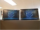
AMD has filed a trademark for an updated design on their Vega logo. The original Vega logo was made out of two full triangles, arranged in such a way as to form the letter "V". The updated trademark has since made an appearance on AMD's professional line of graphics cards, in the form of packaging for the Radeon Pro WX 9100 - likely an effort from AMD to further separate its professional and consumer graphics.

The new logo is the old being revisited, with the same prismatic arrangement, but with added detailing for a 3D effect, which makes sense in the 3D rendering world that AMD's professional graphics cards are used in. Perhaps this AMD investment in updating the branding means a refresh could be coming for its professional graphics card market that still uses the Vega architecture, though this is mere speculation at this point.

Antec Launches the P6: Micro-ATX Chassis Featuring Glass Panel, Logo Projector

Antec Inc., a leading provider of high-performance computer components and accessories for the gaming, PC upgrade and Do-It-Yourself market, presents the latest mid tower of their award-winning Antec Performance Series: the Antec P6. The case is now commercially available from 59€ (suggested retail price including VAT).

Light It Up
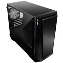
The latest addition to Antec's renowned Performance Series offers a smooth and streamlined appearance - ideal for a versatile micro-ATX build that fits every environment. The compact powerhouse measures 470mm x 200mm x 405mm (DxWxH) and is compatible with micro-ATX and ITX motherboards. The P6 supports VGA cards with a length of up to 390 mm and features a built-in LED logo projector to highlight the desktop set-up. The 4 mm tempered glass side panel makes it easy to show off the build.

INNO3D Presents Its New Outlined Logo and Slogan

INNO3D, a leading manufacturer of high-end hardware components and computer utilities, presents its new outlined logo and slogan. The logo has been updated with a few changes that bring it right into today's modern gaming world and trends. Its new slogan adds strong positioning and attitude to its brand identity.

The new logo INNO3D has been designed in all capitals, creating a strong and unified look & feel that represents a tightly integrated and strong organization. The new design brings a much stronger impact and has a fresh look taking its own place in a modern and highly competitive world. INNO3D's global team is highly committed to bring the greatest computer hardware products to customers and with a 'lean & mean' attitude the company will continue to bring them to market at a very competitive and fair price.
Return to Keyword Browsing
Nov 20th, 2024 04:13 EST change timezone

New Forum Posts

Popular Reviews

Controversial News Posts