Friday, December 23rd 2011

Windows 8 build 8172 Screenshots Emerge

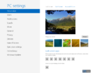
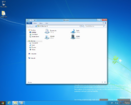
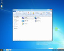
Sometime in 2012, Microsoft is expected to announce its next major version of Windows for the client platform. It has the working name "Windows 8", and was previewed to developers at the BUILD Conference, this September. A member of Chinese tech site PCbeta community got to play with a newer build of Windows, build 8172. Screenshots of its most common user interface elements, such as desktop, Windows Explorer, PC Settings (control panel), etc., were posted. Engadget notes that these screenshots don't reveal much else from the Windows Developer Preview shown at the BUILD Conference.
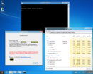
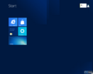
The first screenshot above reveals the Start screen featuring Metro UI design elements (which replaces the Start Menu), the second reveals PC Settings screen, which serves the purpose of the Windows Control Panel, and the next two screenshots reveal the Windows Explorer user interface with its "ribbon" element collapse and expanded.
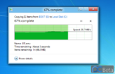
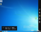
The next screenshot (above), reveals the new file transfer dialog, which provides a little more information than just a progress bar, an animation, and a few numbers. The progress bar embeds a graph that reports transfer speeds in real time. Next up, is the new Task Manager, which gives greater control over running tasks and processes; and the final screen reveals the new sidebar, which makes the taskbar optional. In all, Microsoft plans some major UI changes, while retaining compatibility with many of the elements found in Windows 7, to ease the transition. The window titlebars themselves look identical in function to the ones Windows 7 gives you, but that there are some aesthetic changes. Basically every rounded-edge is sharpened out. The PCbeta member who leaked these screenshots confirmed that build 8172 is still pre-beta.
Sources: PCbeta, Engadget
Add your own comment

75 Comments on Windows 8 build 8172 Screenshots Emerge

#1
btarunr
Editor & Senior Moderator
Inb4 neophobia.
Posted on Reply
#2
newtekie1
Semi-Retired Folder
Windows 8 is terrible, every change they have made is bad! They should have left everything the same as Window 7.
Posted on Reply
#3
MRCL
I like the new Task Manager.

Thats about it.
Posted on Reply
#4
Sasqui
newtekie1Windows 8 is terrible, every change they have made is bad! They should have left everything the same as Window 7.
LOL, what would the call it?

And where the hell is the Angry Birds screen shot? :laugh:
Posted on Reply
#5
RejZoR
Start menu button looks stupid, ribbon looks stupid, right sidebar looks stupid. Only good thing is indeed Task Manager which actually looks good. I really wish they wouldn't change it at all from the Windows 7 looks. It just feels good and refined. Win8 looks like some kid's work on how to enhance Win7 looks. It just looks and feels crappy.
Posted on Reply
#6
Zubasa
Of all the version of Windows, I actually like the look of Vista the most...
Posted on Reply
#7
GSquadron
Windows Vista revision 3.0
If they payed me all the money of work for windows 8 i would not change anything and make all happy xD

Edit: It looks like the windows explorer is similar to office 2010
Posted on Reply
#8
MoonPig
So... I'm the only one that likes the look of Win8?

It's clean, simple and nicely coloured.
Posted on Reply
#9
Stephen.
ZubasaOf all the version of Windows, I actually like the look of Vista the most...
And here i thought it was only me, i don't mind Windows 7, Of all the version of Windows, I like the look of Vista the most.

Windows 8 look:mad: like some one said it's like a doodling kid who made it
Posted on Reply
#10
BrooksyX
I can't decided if I like it or not. Ill probably just stick with windows 7 as I am sure most will. I have a feeling windows 7 will live as long as windows xp did. I just don't see how an OS can get any better for the time being. I havent had a single major issue with 7.
Posted on Reply
#11
Drone
Only the last screen shows something new.

I like 8. It's fast and more optimized. If it also will have a good compatibility then it's awesome. It all that matters to me.
Posted on Reply
#12
Athlon2K15
HyperVtX™
MoonPigSo... I'm the only one that likes the look of Win8?

It's clean, simple and nicely coloured.
you spelled colored wrong :p
Posted on Reply
#13
CrAsHnBuRnXp
Windows 7 is the new XP. The only thing great about Windows 8 is the new task manager. I hate everything else about it. Especially the ribbon style in explorer.

TBH, I dont even know why they are calling this an actually OS as it is completely useless for desktop computers. It is meant more for tablets. I will be skipping this OS all together.
Posted on Reply
#14
dir_d
i like it and will get it if pro is 30 dollars again for students
Posted on Reply
#15
NdMk2o1o
This still isn't a final build people, I am sure they will polish it a lot more before the final release.

I like the right side bar, the functionality anyway not the looks.
I like the new task mgr.
I like the new explorer, all of these things make it more accessible to settings with less clicks which is definately a plus.
Again the looks I hope will change somewhet as it looks like dare I say it...... a BETA!!! oh yea, it is :rolleyes:
Posted on Reply
#16
MxPhenom 216
ASIC Engineer
Theres a lot of hate towards windows 8 apparently. The one thing I am a little iffy on is the way they are really made it Phone and Slate optimized. With this "app" stuff. However I do love the Metro UI.
Posted on Reply
#19
Gzero
AthlonX2you spelled colored wrong :p
You spelt coloured wrong, and don't get me started on your grammar. :p
Posted on Reply
#20
NdMk2o1o
CrAsHnBuRnXpI can deal without all the tablet crap.
Just turn metro UI off shimples
Posted on Reply
#21
Gzero
NdMk2o1oJust turn metro UI off shimples
Windows 8 Bloat Edition :>
Posted on Reply
#22
trickson
OH, I have such a headache
Looks like crap . I will not be getting this . I love windows 7 !
Posted on Reply
#23
MxPhenom 216
ASIC Engineer
NdMk2o1oJust turn metro UI off shimples
Yes that is an option atleast in the build that was released to public months ago to mess around on. You could switch back and fourth.
Posted on Reply
#24
Jstn7477
What's with the solid colored taskbar and window bars and sharp edges? I like Windows 7's translucent, rounded stuff better. This reminds me of not having an Aero capable GPU and getting stuck with that fugly gray theme.
Posted on Reply
#25
Lazzer408
nvidiaintelftwYes that is an option. Desktop users will still have our legacy desktop and everything your used to on Windows 7
Our? Are you a member of the design team? If so, we need to talk. ;)
Posted on Reply
Add your own comment
Nov 13th, 2024 21:12 EST change timezone

New Forum Posts

Popular Reviews

Controversial News Posts