Wednesday, January 11th 2012

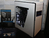
NZXT Switch 810 Full-Tower Chassis Pictured
Riding on the success of its Phantom Series case designs, particularly of the ones that are white with a dash of black, NZXT unveiled the Switch 810 ATX full-tower chassis (model: CA-SW810-W1) at CES. The Switch 810 uses many of the "sharp angles" design elements of the Phantom series. It is characterized by a large acrylic window on its side panel, through which you can admire your creation.
According to the placard, it measures 235 x 595 x 585 mm (W x H x D), its motherboard tray is capable of holding large XL-ATX and EATX motherboards. It has four 5.25" exposed drive bays, NZXT populated two of these in its demo rig with Sentry Mix fan-controllers (not included with the case). The bottom-most of these includes a 3.5"/2.5" docking bay to hold and hot-swap one drive. The dock is detachable to vacate the 5.25" bay. The front-panel cluster is located behind a door above the 5.25" bays. Internally, the case is said to have about six 3.5"/2.5" bays.Moving on to ventilation, the case has provision for two 140 mm intake fans in the front, one is included with the case; up to three 140 mm exhaust fans on the top, one included; one 140 mm rear exhaust (included); two internal circulatory fans at the HDD bays, one included; and provision for two fans on the bottom. As an XL-ATX capable case, the Switch 810 has 9 expansion slot bays. This case will be launched early next week.
According to the placard, it measures 235 x 595 x 585 mm (W x H x D), its motherboard tray is capable of holding large XL-ATX and EATX motherboards. It has four 5.25" exposed drive bays, NZXT populated two of these in its demo rig with Sentry Mix fan-controllers (not included with the case). The bottom-most of these includes a 3.5"/2.5" docking bay to hold and hot-swap one drive. The dock is detachable to vacate the 5.25" bay. The front-panel cluster is located behind a door above the 5.25" bays. Internally, the case is said to have about six 3.5"/2.5" bays.Moving on to ventilation, the case has provision for two 140 mm intake fans in the front, one is included with the case; up to three 140 mm exhaust fans on the top, one included; one 140 mm rear exhaust (included); two internal circulatory fans at the HDD bays, one included; and provision for two fans on the bottom. As an XL-ATX capable case, the Switch 810 has 9 expansion slot bays. This case will be launched early next week.

9 Comments on NZXT Switch 810 Full-Tower Chassis Pictured
They should get rig of that black part in front, or change it to white looks like crap this way
Looks Stylish with a bit of see-through naughtyness (A)