Thursday, November 28th 2013

Lian Li Unveils PC-A51 Prototype, Seeks Feedback Before Launch
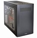
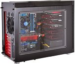
Lian Li posted pictures of an unreleased prototype case, which it named PC-A51. Design of the new all-aluminium, wide-body ATX mid-tower case is not finalized, and the company is seeking feedback from the PC enthusiast community (you can leave your comments with us). The PC-A51, in its current iteration, starts off signature Lian Li style - a black aluminium monolith, but tries out something unusual with its clear acrylic window, and metallic red interiors. The motherboard tray, along with portions of the drive cages, and the rear panel, feature a contrasting of black and red. The case features a front-oriented PSU bay. The case has room for add-on cards as long as 28 cm, PSUs as long as 16 cm, and CPU coolers as tall as 17.5 cm.
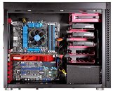
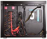
The motherboard tray on the PC-A51 prototype can seat boards in common ATX, micro-ATX, and mini-ITX form-factors; along with the internal drive bay, it's largely tool-free. There's room for five 3.5-inch drives (each tray can stack up to two 2.5-inch drives), and a 5.25-inch drives. Ventilation includes a 140 mm front-intake, two 140 mm top exhausts (which can hold on to radiators as big as 140 x 280 mm); and a 140 mm rear exhaust. The back side of the motherboard tray has clearance of up to 2 cm, which can let you handle your cable spaghetti better. Front-panel connectivity include four USB 3.0 ports (standard header), an eSATA port, and HD audio jacks.
The motherboard tray on the PC-A51 prototype can seat boards in common ATX, micro-ATX, and mini-ITX form-factors; along with the internal drive bay, it's largely tool-free. There's room for five 3.5-inch drives (each tray can stack up to two 2.5-inch drives), and a 5.25-inch drives. Ventilation includes a 140 mm front-intake, two 140 mm top exhausts (which can hold on to radiators as big as 140 x 280 mm); and a 140 mm rear exhaust. The back side of the motherboard tray has clearance of up to 2 cm, which can let you handle your cable spaghetti better. Front-panel connectivity include four USB 3.0 ports (standard header), an eSATA port, and HD audio jacks.


28 Comments on Lian Li Unveils PC-A51 Prototype, Seeks Feedback Before Launch
edit: sorry for the ninja edit. I replied to the wrong thread before. Now it's corrected.
I'd rather PSU heat got expelled out the front, as opposed to being expelled across the CPU and GPU's, so this airflow layout makes sense.
2) I would add a floor intake fan (with filter of course)
3) don't like usb and power/reset buttons on top. just not convenient, and dangerous.
4) give people options to have usb ports-buttons panel on the bottom of the front or at the top of the front. like a optical slot cover, so you can have it anywhere. customization at no cost.
1. The motherboard needs to be raised enough to add two 120/140mm fans at the bottom with filter (at the moment this case is a dust magnet).
1b. With the motherboard raised holes can be added for USB/Audio cables to be allowed through
2. PSU filter needs to be accessible the same side as the bottom fan filter (window side).
3. Rear and front 120/140mm fan need to be exhaust, or the rear needs a filter option.
4. Some kind of shield to cover cables away from the GPU's.
Lian Li would get my money.
1. front panel too flat, add more accent would be good
2. top panel of case should flat, it looks bad with bump
3. idea of placing hdd like that is good but im kinda worry for long term since it just hanging with hook to tray
4. add some cover for hdd would be great
Ye, that makes sense.
Also, If I am not mistaken, that PSU is intaking air from the bottom of the case.
I'd buy it to replace the case for my APU system (MSI ATX Motherboard), the aluminum is rather classy.
2. The presence of optical drive is extremely disturbing to me.
3. One of the best component layouts i have ever seen.
Hey, Lian Li, listen to the pros here. Yeah, really you could take the ODD out, and pre-prepare it for at least 2 SSD. Bottom fan with filter. And make radiator top panel a paid option for the water cooling vvhores, 90 % of us don't need open tops, we need that space for leaving magazines and books . ;)
Honestly, I just wish they'd return to the PC-A05N layout. With two intakes at the top, ventilation at the front and slightly better cable management, it would have been perfect.
Get rid of the window.
Dunno why people don't like the red. I sort of like it.
My main concern is the proximity of PSU cables to motherboard SATA ports. If you have a board with right-angled SATA ports you will have a tough time plugging/unplugging SATA cables with the PSU in place, in fact I'd say that you'd probably have to uninstall the PSU to achieve this. Additionally, PSUs longer than the ATX spec of 140mm are gonna be a problem.
My suggestion: extend the case (front to back) by ~2cm - basically inserting a 2cm gap between the motherboard and the drives/PSU. Not only will that allow clearance with standard sized PSUs, it will allow people who want to use longer PSUs to do so (obviously they will then have to deal with SATA/PSU cable clashes).
Other suggestions:
1. Make it slightly taller by adding an 8th PCI slot. This will give some clearance between the bottom of the case and the mobo, allowing for routing holes in the mobo tray for audio/USB/front panel cables. The additional PCI slot space can then be used for an addon card, or USB headers, or some 15mm slim fans.
2. Keep the 5.25" bay. People may not use optical drives anymore, but they sure as hell use fan controllers.
3. Colour scheme seems to be half-arsed, i.e. the red can't be seen unless you're looking at the back of or inside the case. Maybe add some red highlights down the left/right of the front panel and/or colour the top mesh red.
- I understand the reasoning behind placing the motherboard lower in the case, so thick radiators can fit at the top, but this placement makes it impossible to use the third PCIe slot impossible AT THE SAME TIME with anything mounted on the fan grill at the bottom of the case. Not a huge issue, I think very few people use 3 graphics cards, but it's worth mentioning.
- I suggest moving the fan grill as far away from the motherboard tray as possible, towards the windowed side panel (I would even suggest making the case wider to accomplish this), so even if the user decides to use the fan grill (mainly to mount a fan, but a water pump or a reservoir could also be mounted there) he can still access the connectors on the bottom of the motherboard. Motherboards usually have an USB3 connector there, and most importantly, the front panel IO pins. For example, using the motherboard from the picture, with the bottom fan grill used, you would need to remove the fan if you wanted to use the USB3 headers on the board, use the power button or the IO pins. I think a good chassis must be compatible with as many hardware configurations as possible,
- It would be extremely nice if there was a way to cover the holes used for routing the SATA and power cables to the hard drives, if you weren't using the trays. Above the PSU, behind the bottom two hard drive trays, you can see the SATA and power cables through those openings. Sure, with a lot of effort, you could probably manage to route your cables in such a way that they don't cross those opening, but that means a. A lot more unnecessary work, and b. You would still have visible holes in the motherboard tray. I suggest a piece of molded plastic that fits in those holes to cover them, it can be black or red.
Picture 4 (back of the motherboard tray):
- I don't know who does your builds, but that is not the way to route an 8 pin CPU cable. The cable should be routed around the motherboard tray cut-out, because in the position from the picture you won't be able to install a CPU cooler bracket without unplugging the cable. And plugging the 8 pin after installing a tower cooler is almost impossible. You could plug the 8 pin after you installed the bracket and before you mounted the cooler, but that is too much of a headache and I can guarantee it that a LOT of people won't think about doing that, resulting in them having the remove the freshly installed CPU cooler to plug in the 8 pin, then reinstalling the cooler, and that means a lot of annoyed customers. For routing the 8 pin around the motherboard cut-out I also suggest adding a few tie points, at the very least one at the bottom right corner of the cut-out.
- Regarding tie points, I see none, maybe you wish to add at least a few for neat cable management. I don't think that adding those tie points would ruin the aesthetics of the case. Drop me a message if you are interested in what I think about the best location for the tie points, I can make a picture.
- I think there should be a rubber grommet for the 8 pin cut-out too. The cut-out is more visible in this case because it is farther from the top than in a regular case, and I believe it would definitely improve the quality of the chassis for a relatively low investment.
not enough space for intake air
should extend length another 4cm at least,longer psu support,more space and more intake air
Include fan controller, too many board makers don't have enough connectors for software controller!
Get rid of window can't use the computer and look thorough window at the same time, once you've seen the innards you've seen them.
the pc market is better off with lian li putting out new looks