Friday, September 2nd 2016

Corsair's Boldly Styled Air Series 740 Chassis Pictured

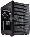
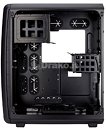
Following up on the disruptive Air series 540 chassis launch, Corsair is ready with the larger, more boldly styled Air 740. Pictured below, the vertically-partitioned dual-chamber case one-ups the main design quirk of the 540's asymmetric look, with a new, bold-looking front that has hints of enterprise/workstation styling to it.

Inside, you get room for an E-ATX motherboard, some very tall and long graphics cards, CPU coolers, liquid cooling setups, and a boat-load of drives, including 5.25-inch, a well-plated 3.5-inch external drive bay, and multiple internal 3.5-inch/2.5-inch drive bays. The left side compartment has room for the PSU, and a number of drive bays. We spy multiple radiator bays. The case measures 458 mm x 415 mm x 332 mm (HxDxW). It's listed on Italian online store Draco.it for €159.90 including taxes.
Source: Comptior-Hardware
Add your own comment

27 Comments on Corsair's Boldly Styled Air Series 740 Chassis Pictured

#1
ZoneDymo
dear lord that is ugly, I guess its kinda ok from a server/industrial type of look though
Posted on Reply
#2
avatar_raq
I like the looks of 540 more. I was considering it for my PC but the only thing that kept me from buying was the limited 3.5" drive bays. Let's hope Corsair won't repeat the same mistake again.
Posted on Reply
#3
Drako77
JetsterDrako.it is a web site not a case
Yes, i'm the owner ;) The case (cabinet) is here, i ment, the correct link is here :D
Posted on Reply
#4
Jetster
Drako77Yes, i'm the owner ;) The case (cabinet) is here, i ment, the correct link is here :D
I get it now it was a typo in btarunr's post
Posted on Reply
#5
micropage7
ZoneDymodear lord that is ugly, I guess its kinda ok from a server/industrial type of look though
Yea, ugly..
Why dont they make flat and simple than that
Posted on Reply
#7
Joss
It's the 540 with a different face, no improvements to the interior, same very poorly optimised second compartment; didn't they see the Fractal 804?
And I bet it'll show the usual Corsair shitty build quality, including those paper thin side panels.
Posted on Reply
#8
Caring1
Now with more added dust collecting shelves.
Posted on Reply
#9
RejZoR
Kinda like it. Just not the windowed side panel...
Posted on Reply
#10
ensabrenoir
.....I kinda like it. Would have to see it in person though. I had both the Air 540 and 240..... hard to improve upon the classics...but don't think this is that bad.
Posted on Reply
#11
Finners
I like the internal layout. Bigger than my cooltek w2 but same two chamber with psu on its side idea. Looks to have room for a rad at the top which would be a massive plus over my case but damn is that ugly.

Hopefully they will do another one with a more refined(boring) outside.
Posted on Reply
#12
AsRock
TPU addict
JossIt's the 540 with a different face, no improvements to the interior, same very poorly optimised second compartment; didn't they see the Fractal 804?
And I bet it'll show the usual Corsair shitty build quality, including those paper thin side panels.
Yes i have been waiting for a improved 540 and sadly this is not it.

Although i am more after a 2 in 1 case really but i nearly got the 540 some time back but thought i needed a case that can fit 2 PC's in more.
Posted on Reply
#13
EzioAs
ZoneDymodear lord that is ugly, I guess its kinda ok from a server/industrial type of look though
I have to disagree. I actually like the look. Can't say I like it better than the 540/240 but it actually looks really good to me.
Posted on Reply
#14
bogami
Nice new skin . Interesting appearance, but I prefer the old.
Posted on Reply
#16
ensabrenoir
A review........

......missed it again :ohwell:
Posted on Reply
#17
Joss
Tweaktown asks to disable my ad blocker. I did and the pages took ages to load, my CPU usage went above 50% and I couldn't even read the text in peace because they have ads between paragraphs.
Screw tweaktown.
Posted on Reply
#18
EzioAs
JossTweaktown asks to disable my ad blocker. I did and the pages took ages to load, my CPU usage went above 50% and I couldn't even read the text in peace because they have ads between paragraphs.
Screw tweaktown.
Yeah, I haven't visited Tweaktown in quite some time because of the terrible and very cluttered site. Hexus and Legit Reviews have reviews of the case if you'd like to read them.
Posted on Reply
#19
Assimilator
No 5.25" bays and no built-in fan controller? No purchase from me. The 540 had a pair of 5.25" bays, how come this more expensive chassis doesn't?
Posted on Reply
#20
Disparia
Yeah, I'm liking it as well. Gives me a Onyx2 vibe (used one back in the 90's).


Not that I would purchase one as a personal station; I've already been through my big case phase and am happy with ITX. But it would be kinda nice to do one of these Air 740's up as a show piece.
Posted on Reply
#21
pat-roner
Now give me one with solid sidepanels
Posted on Reply
#22
RealNeil
Not sure if I like this or not. I bought an Air 540 quite a while back and never used it. I liked it in reviews at the time, but when I actually saw it here, I didn't.
It's just sitting in the box, not collecting dust.
Posted on Reply
#23
ensabrenoir
RealNeilNot sure if I like this or not. I bought an Air 540 quite a while back and never used it. I liked it in reviews at the time, but when I actually saw it here, I didn't.
It's just sitting in the box, not collecting dust.
...same feeling here too..... awesome case that i could not get to blended in. Just like my cosmos. Ended up selling both...gonna buy a used cosmos 2 (server)......and build a bigger man cave :rockout:
Posted on Reply
#24
TheDeeGee
Nothing beats the slick look of a Fractal or Antec Performance Case.
Posted on Reply
#25
Joss
I wish Fractal would come up with a Node 904,
that would be my dream case.
Posted on Reply
Add your own comment
Nov 23rd, 2024 20:14 EST change timezone

New Forum Posts

Popular Reviews

Controversial News Posts