 0
0
Akko 3108v2 King Koi Review - Lucky Calligraphy
Disassembly »Closer Examination

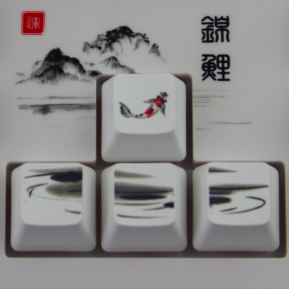
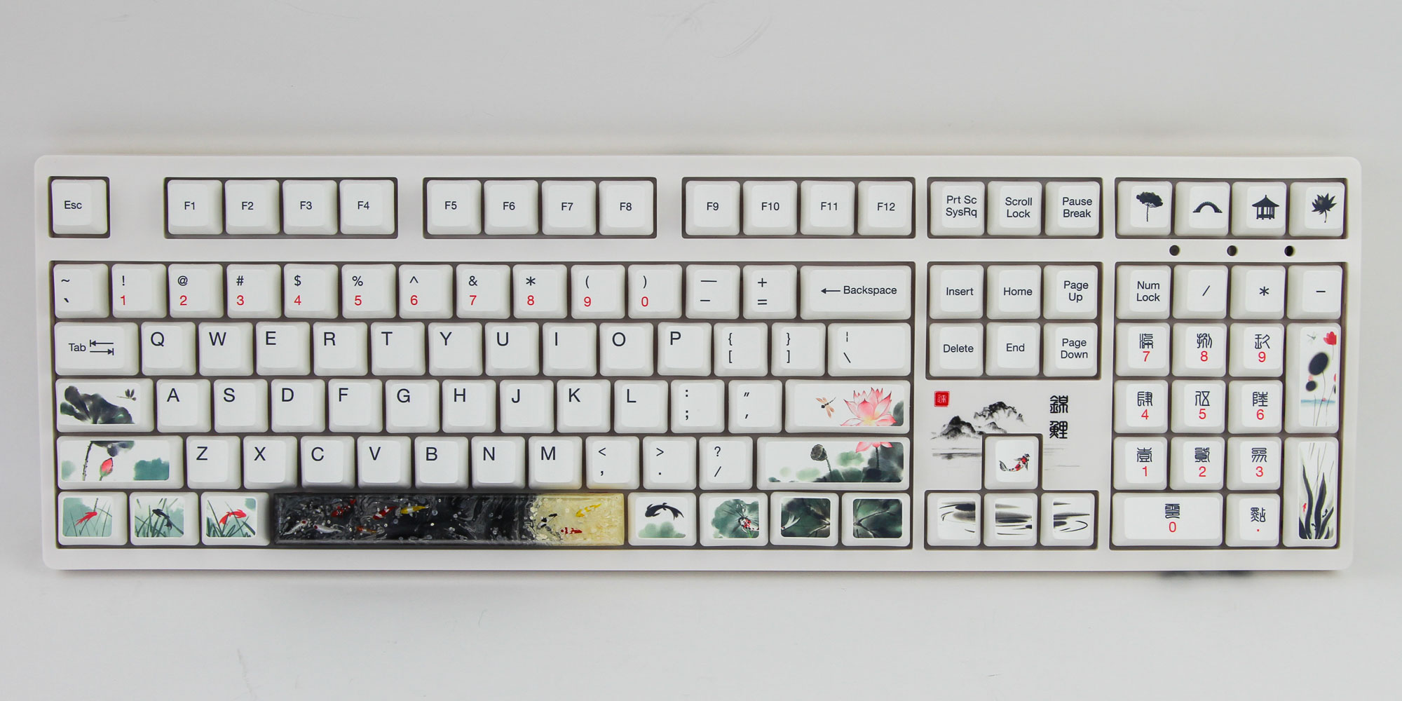
Photographing the Akko 3108v2 King Koi on a white background isn't the easiest thing in the world. The use of a white base throughout is a deliberate choice, which makes this a far more subtle take on the Koi theme than what we saw with the turquoise Monet's Pond from the same company. The theme in question is King Koi, but draws inspiration from old Chinese calligraphy with black ink strokes on parchment paper. The whole design is taking wordplay to a new level with the use of the older-style script, but there is also another part to the product name: 吉庆有余 (Jíqìng yǒuyú), meaning good luck or inspiration, wherein the last character, 余, has the same pronunciation as 鱼 (Yú), which means fish.
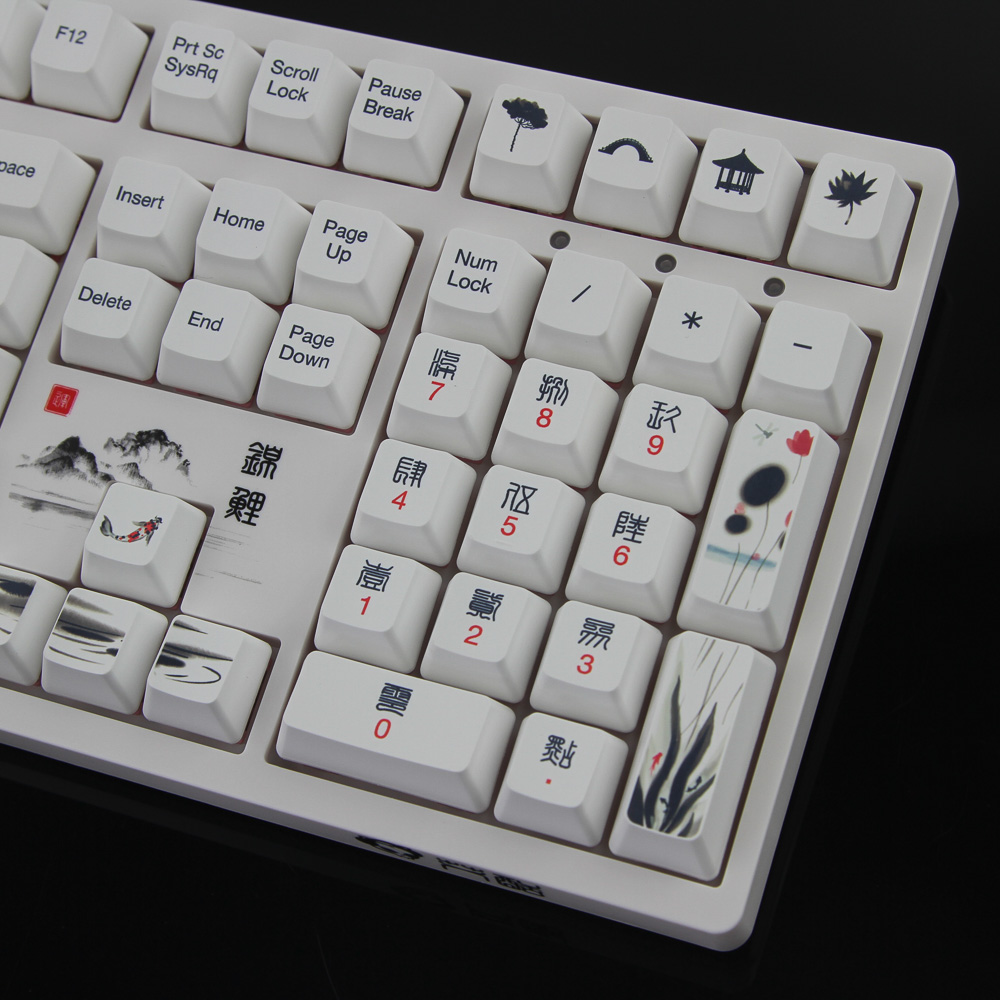
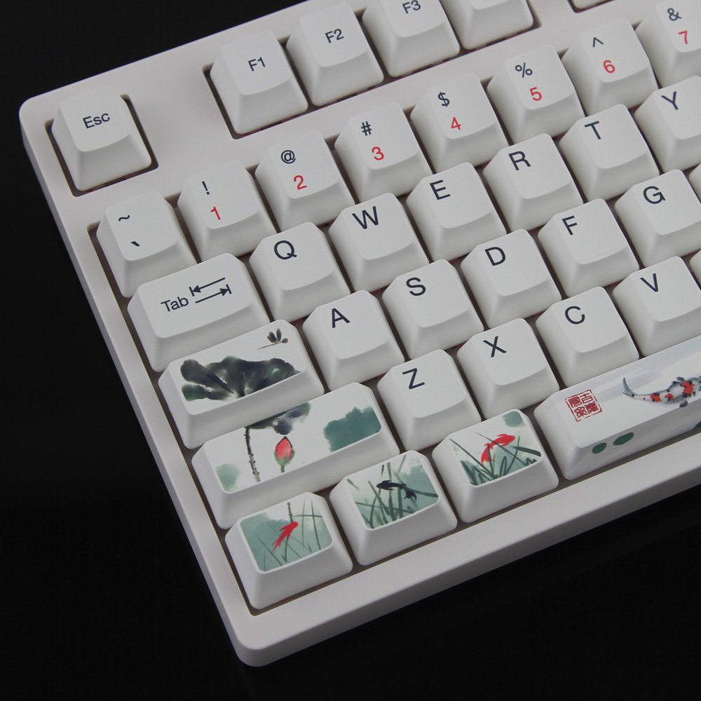
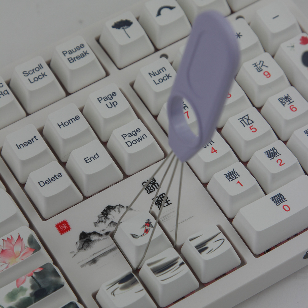
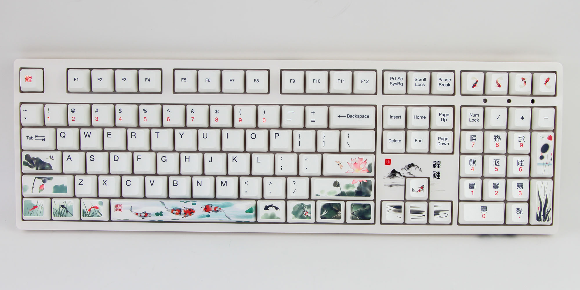
In fact, my annoyance with the use of the Hiragana script with Monet's Pond has been replaced by the same for this older Chinese script, albeit to a lesser degree since it at least matches the theme far more than before. There are direct translations to the numbers on the numpad, which are located above the numbers and in black to contrast the red used for the Arabic numerals. There is the 錦鯉 (Koi) again, above the arrow keys, along with a cool-looking rendition of the mountains illustrated on the product box and referred to in the proverb on the back of the box. Red is used for the numbers on the alphanumeric section too, and we once again see these placed underneath the secondary legends in black. All legends are biased towards the left, including single legends that are more top-left. The lack of backlighting means there is no restriction on placement and size otherwise. Branding comes as a matching Akko logo with more script in the bottom-right corner on the side facing you, though the only branding needed is the actual design.
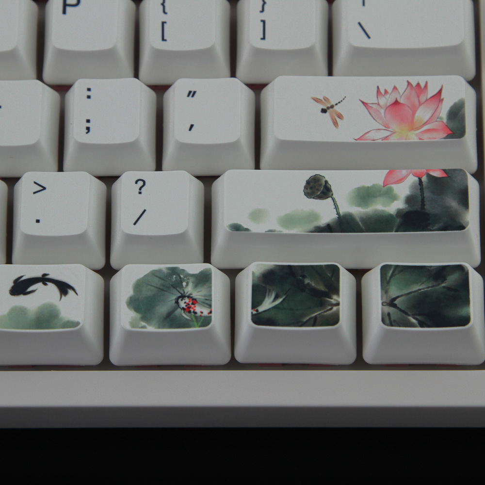
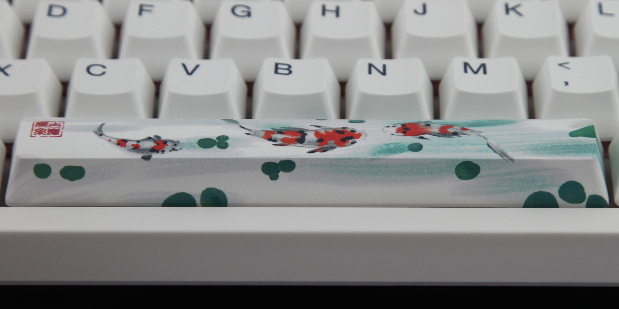
This is ultimately a standard full-size 104-key keyboard with four additional keys above the numpad for volume control, as well as a shortcut key to pull up the calculator. However, you would not know what those extra keys do since they have designs of physical elements you would see in a well-maintained Koi pond, including a short bridge, a resting place, and ferns. This is followed through by a much larger design that is split up onto several keycaps. Especially the modifiers on the alphanumeric section follow the same design as on the product box, including lotus flowers and leaves, ferns, and, of course, the ubiquitous Koi fish swimming around. The colors are less flashy than on the Akko Monet's Pond theme, but no less impactful.
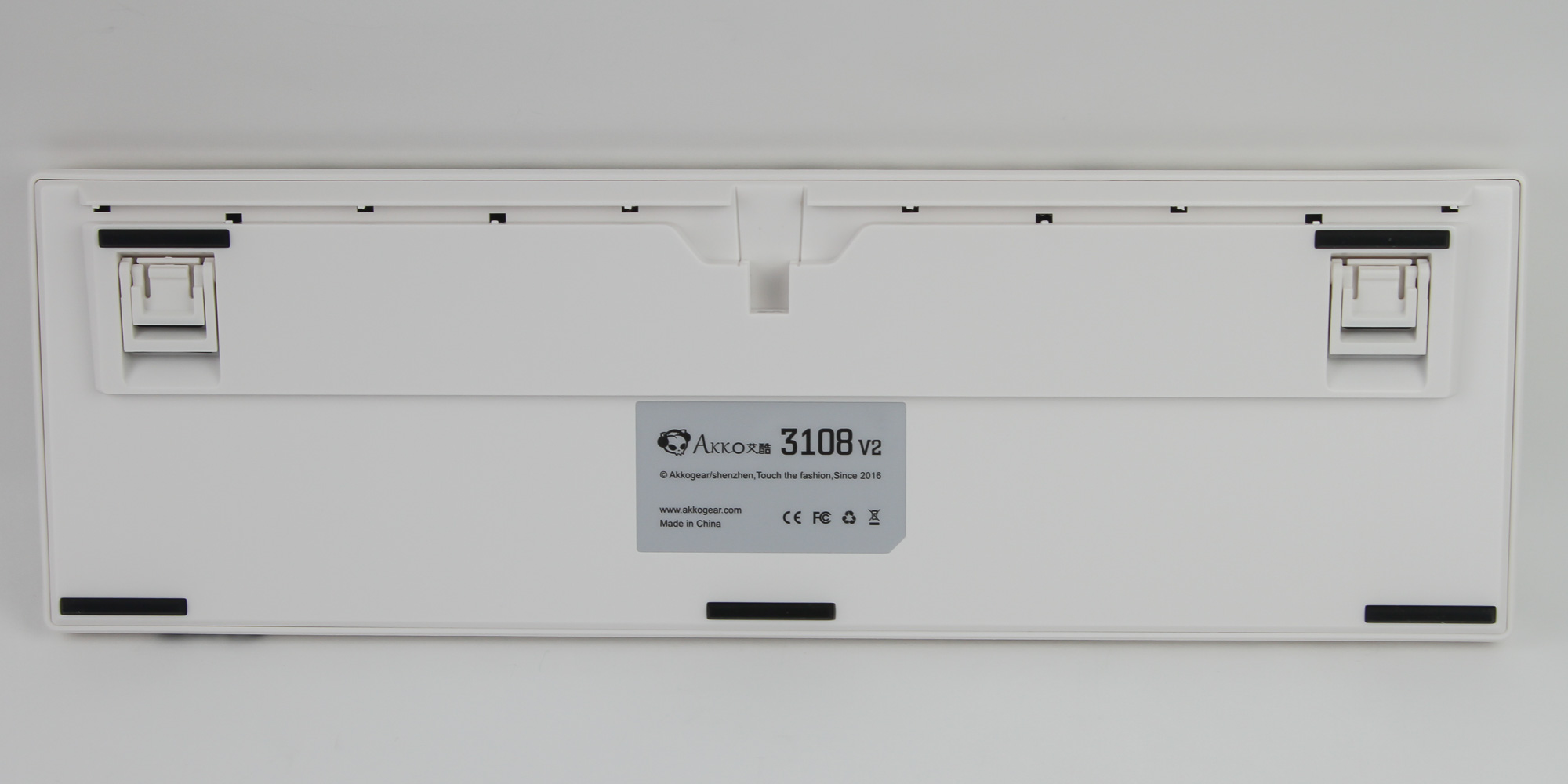
Flipping the keyboard around, we see the usual certification sticker in the middle, as well as five long white rubber pads on the sides for friction against the resting surface and to prevent scratches to the case. Akko includes two separate sets of case feet at the top for a total of three elevation steps, and these feet are large enough not to slip. There are rubber pads on the bottom of the feet, which is always a nice detail. Also note that the feet are part of an already raised segment of the bottom plastic panel, so even the default elevation is steeper than usual.
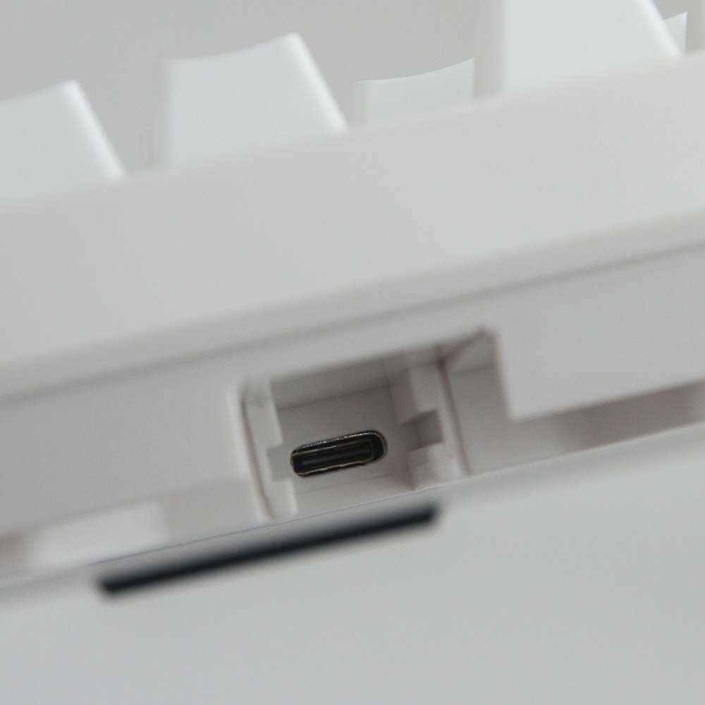
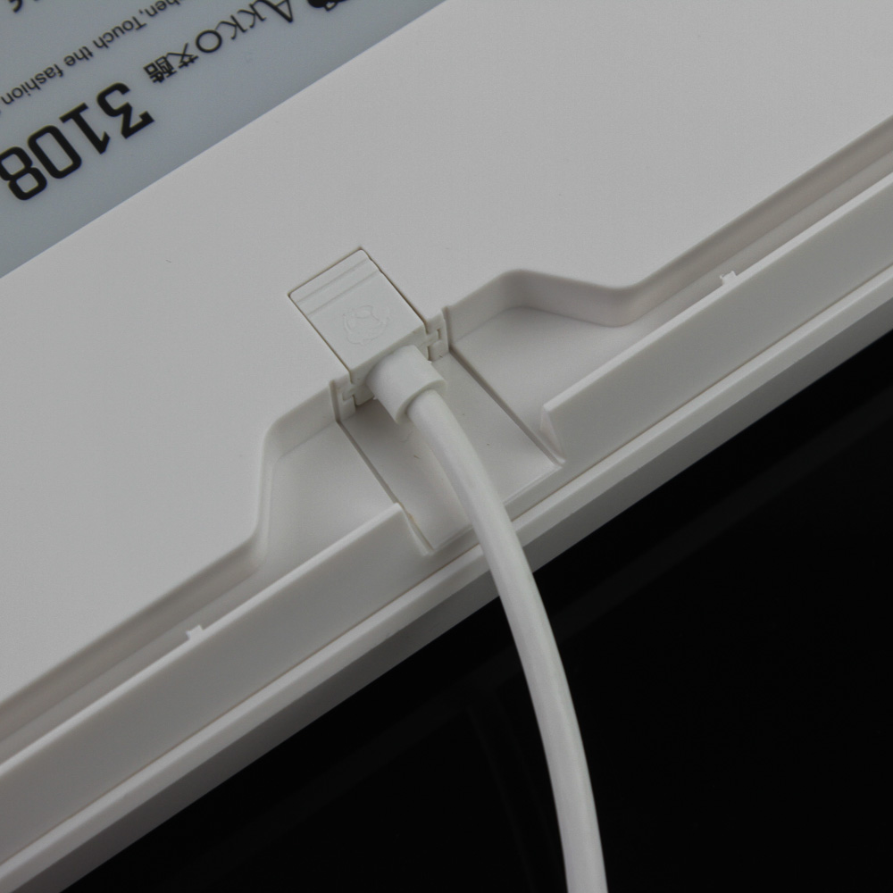
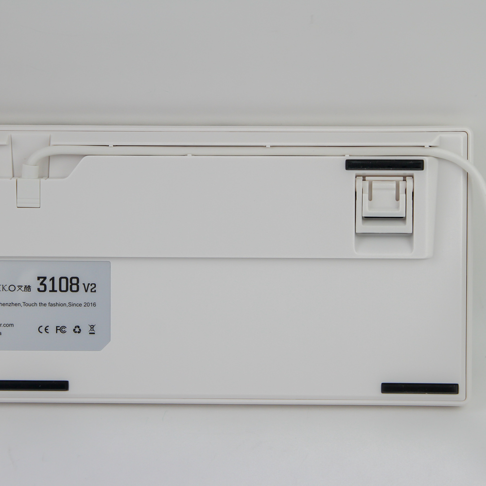
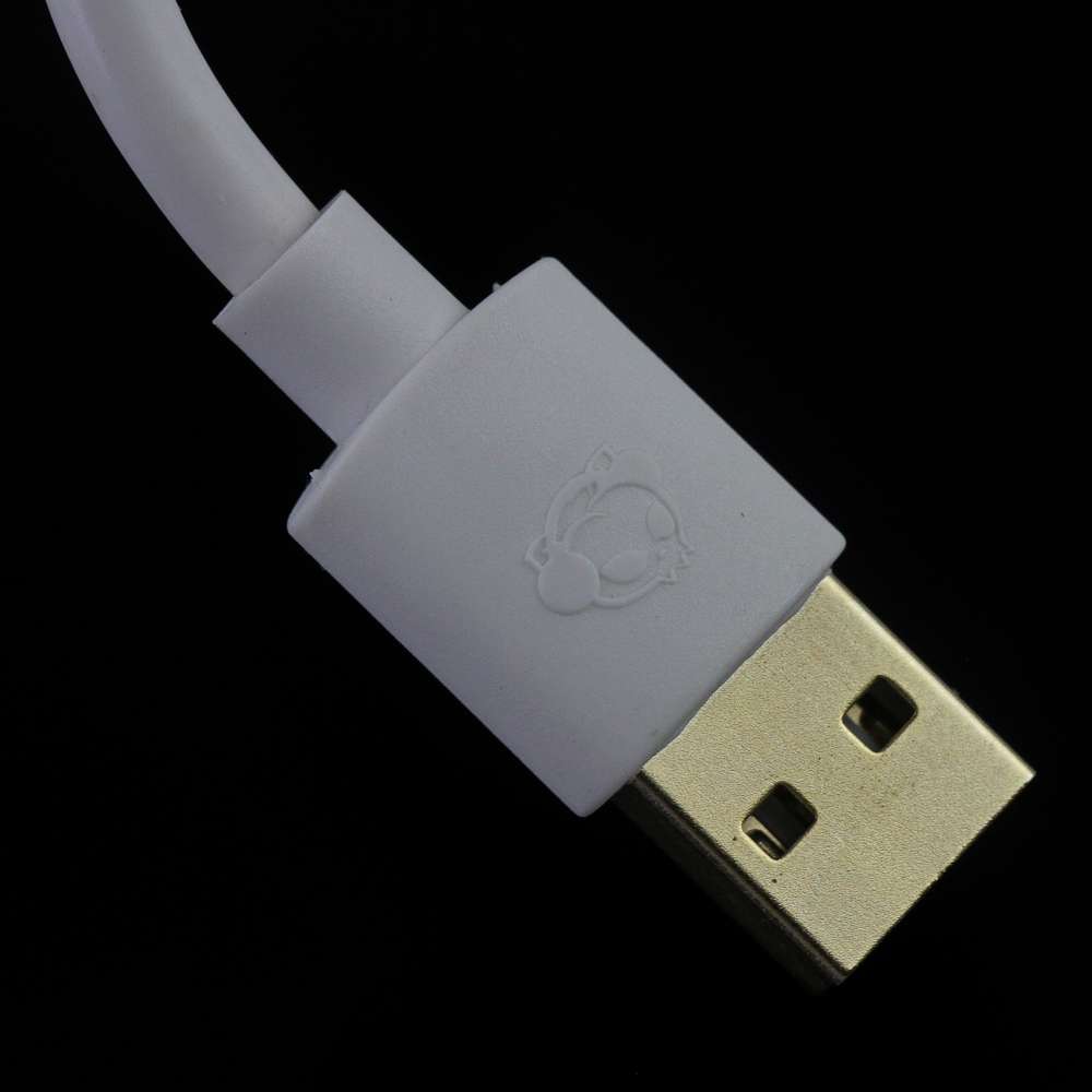
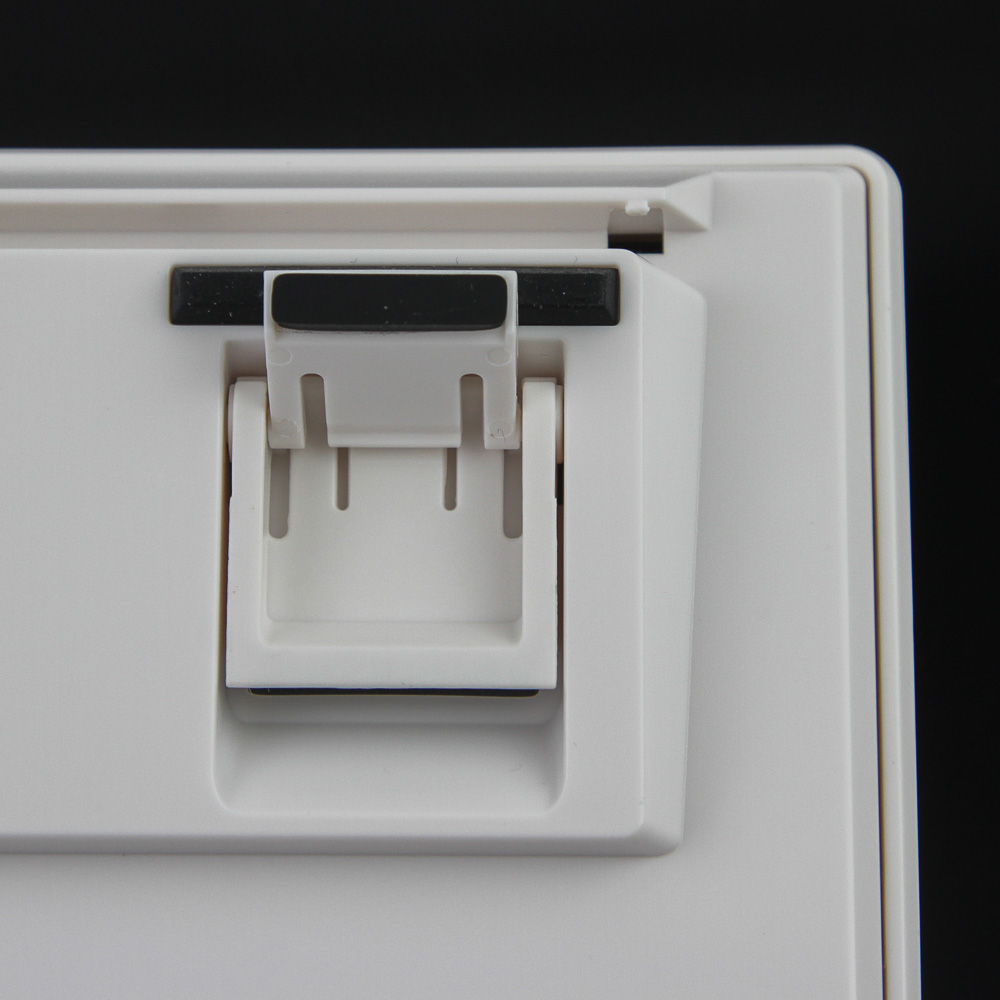
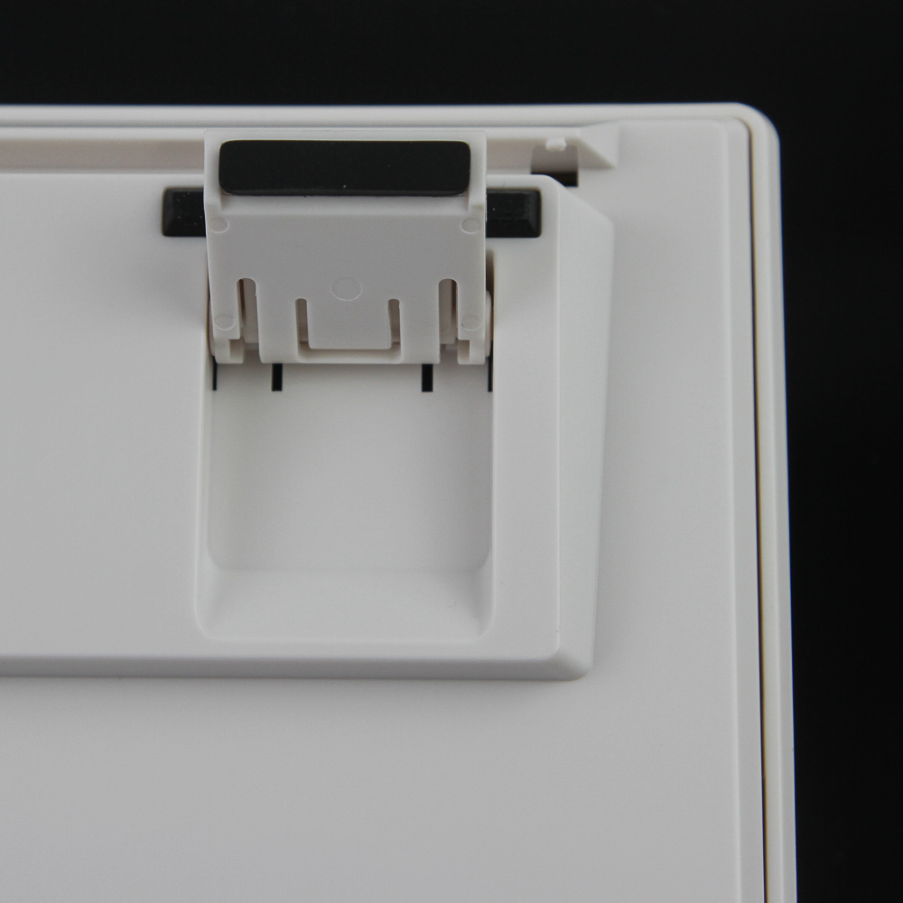
There is an extremely inset connector in the middle of the case on the back, with the case including guides on the cable connector housing that will be hard to use with aftermarket cables unless they are low profile. This prevents the cable from slipping out easily, keeping it securely in place when installed. There are also three built-in cable-management channels—the default in the middle and two longer channels for the left and right. Nibs in these channels help retain the cable, though they might cut into its plastic insulation. A braided cable would have been nice, but I suspect it would not have matched the color as well. The cable is the standard 6' long and plugs into an available USB Type-A port on your computer. The connectors are gold-plated for oxidation resistance, and USB 2.0 is plenty for power and data alike.
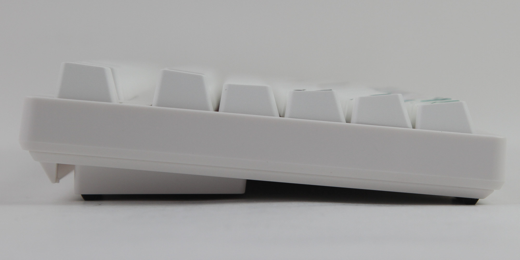
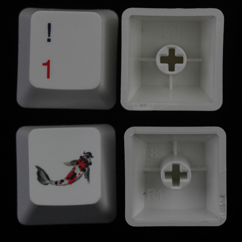
Akko makes several keycap sets and has chosen the OEM profile for the 3108v2 King Koi. There are the expected six slanted rows of contoured keycaps, which will make it quite easy to transition over to this keyboard if using a typical mechanical keyboard already. The provided keycap puller works very well, with adequate spacing between keycaps to fit the wires through. As with the replacement keycaps seen on the previous page, the stock keycaps are made out of thick PBT plastic (average wall thickness 1.38 mm) with dye-sublimed legends and designs on all applied sides, which makes for excellent stock keycaps that will last for the lifetime of the keyboard. Backlighting support isn't much of a thing on these keycaps, however. Not that it matters as the keyboard does not support it anyway. Third-party keycap compatibility is high, but why would you even buy this keyboard if you want to change keycaps? The designs are very detailed, including subtle shades of the same color to better represent how ink spreads on paper. One potential issues is that the keyboard is quite elevated to begin with, with the feet adding to it but not changing the height at the bottom. A wrist rest would be good for those not used to touch typing with their hands hovering over the keys, but there is no optional matching wrist rest this time around, unlike for the Akko Monet's Pond set that also got a matching desk pad.
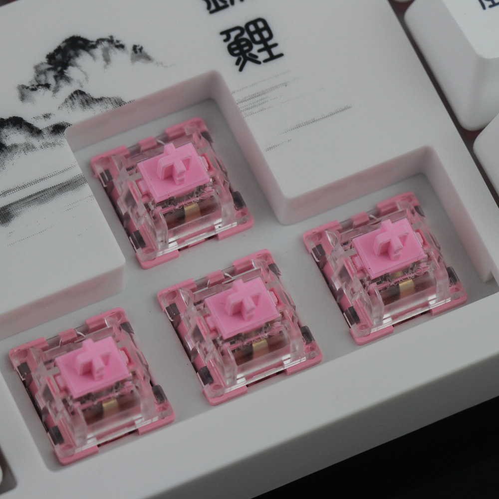
There are six mechanical switch options with the 3108v2 King Koi: three from Akko and three from Cherry in the form of the MX Red, MX Brown, and MX Blue. Akko switches are quickly getting confusing to newcomers, however. It started off with the first-generation Akko Pink, Orange, and Blue. These are the three first-party switches on offer here. But Akko quickly made updated versions of each of these three respectively named 2nd Gen Pink, 2nd Gen Orange, and 2nd Gen Blue. On top of this, there are now more switches that are part of a whole other series called Akko CS, including the CS Ocean Blue we saw in the Akko Black & Pink 3098. The CS Ocean Blue is a tactile switch, whereas the Akko Blue/2nd Gen Blue is a tactile and clicky switch. So there is no direct comparison with the naming, either. The first-generation Akko switches are being phased out, so you will at least soon only have to worry about two Akko switch series.
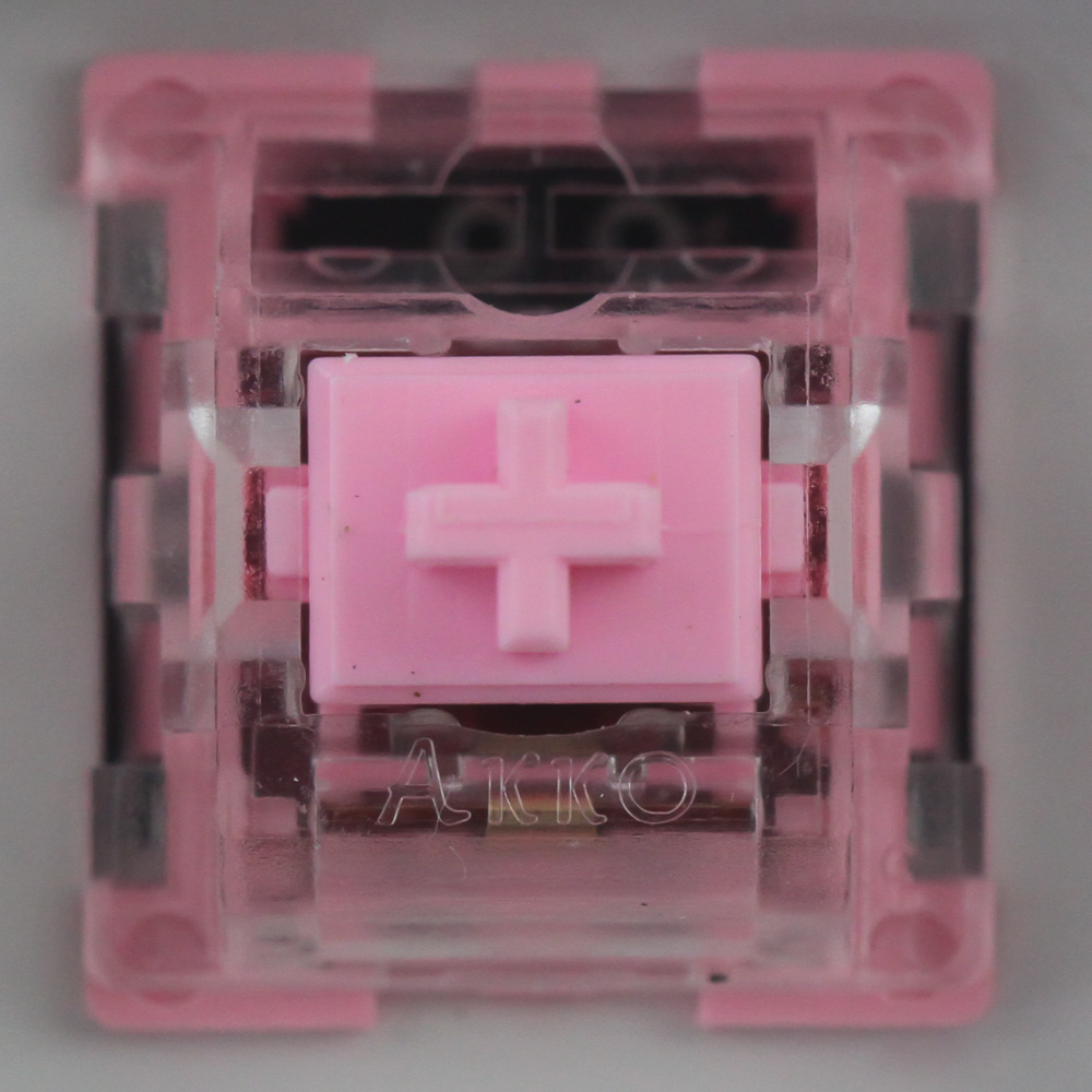
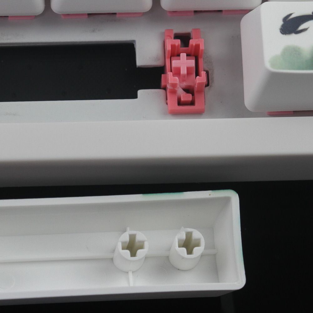
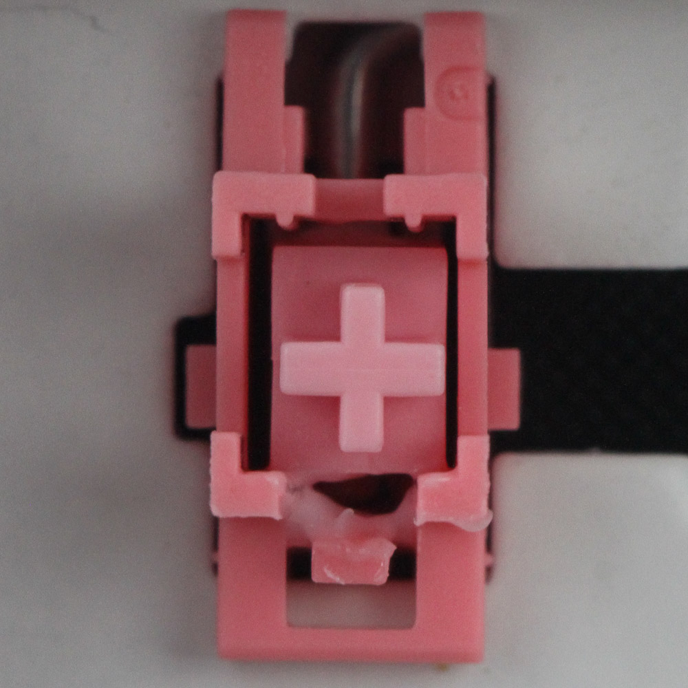
My sample uses the Akko first-generation Pink switches, which use multiple shades of pink throughout, including a translucent pink for the housing to diffuse any lighting from LEDs underneath. The stem/slider is a pastel pink, and even the pins on the bottom are the same color. There are holes in the PCB for LEDs if you want to somehow jig your own, but doing so would not be trivial, though Akko mentions that users can mod in LEDs. The larger keycaps use Cherry-style stabilizers in a darker pink than the switch stem, and these have been lightly lubricated. The stock keycaps do help reduce that mushy feeling somewhat, but it's still a mushy space bar key no matter which way you hit it. Thankfully, the lubrication mitigates that rattly feeling with these stabilizers, which makes it better than average, too.
Here is a look at five of the replacement keycaps on the top left and right corners, which in hindsight makes the single Esc keycap considerably less useful knowing it is part of the set of two. The other four on the corners add more Koi to the mix, although I think Akko should have also included a set of keycaps with a calculator and the dedicated volume control shortcuts on them for functionality. I have also thrown in a bonus photo with the Jelly Key Zen Pond artisan space bar keycap we saw earlier, which in that particular Ghost Asagi design looks fantastic here if I may say so myself. I do wish the yellow base on the left were more white, though. However, this is still the style of add-on keycap I would use here.
Jul 1st, 2025 22:47 CDT
change timezone
Latest GPU Drivers
New Forum Posts
- PCMA2305 Phase Change Metal Alloy (PCMA) (7)
- Best motherboards for XP gaming (18)
- What would you buy? (32)
- Is my m2 possibly fake ? and possible laptop hardware damage ? (28)
- HP Zbook 15 G2 GPU Upgrade (4)
- Help me overclocking my GSkill Ripjaws 3200MHz CL 16 DDR4 RAMs. (20)
- MACPRO 3,1 booting windows (0)
- My PCIe5 SSD is slow. Samsung 9100 PRO (29)
- Steering wheels, I think I had a mea culpa! (0)
- My PSU died.. (1)
Popular Reviews
- ASUS ROG Crosshair X870E Extreme Review
- Crucial T710 2 TB Review - Record-Breaking Gen 5
- Sapphire Radeon RX 9060 XT Pulse OC 16 GB Review - An Excellent Choice
- AVerMedia CamStream 4K Review
- Upcoming Hardware Launches 2025 (Updated May 2025)
- AMD Ryzen 7 9800X3D Review - The Best Gaming Processor
- Lexar NQ780 4 TB Review
- Sapphire Radeon RX 9070 XT Nitro+ Review - Beating NVIDIA
- AMD Ryzen 9 9950X3D Review - Great for Gaming and Productivity
- NVIDIA GeForce RTX 5060 8 GB Review
TPU on YouTube
Controversial News Posts
- Intel's Core Ultra 7 265K and 265KF CPUs Dip Below $250 (288)
- NVIDIA Grabs Market Share, AMD Loses Ground, and Intel Disappears in Latest dGPU Update (208)
- Some Intel Nova Lake CPUs Rumored to Challenge AMD's 3D V-Cache in Desktop Gaming (140)
- NVIDIA GeForce RTX 5080 SUPER Could Feature 24 GB Memory, Increased Power Limits (112)
- Microsoft Partners with AMD for Next-gen Xbox Hardware (105)
- NVIDIA Launches GeForce RTX 5050 for Desktops and Laptops, Starts at $249 (105)
- Intel "Nova Lake‑S" Series: Seven SKUs, Up to 52 Cores and 150 W TDP (100)
- NVIDIA DLSS Transformer Cuts VRAM Usage by 20% (91)