Thursday, December 1st 2016

Gainward Intros the GameSoul GeForce GTX 1080 and GTX 1070 Graphics Cards
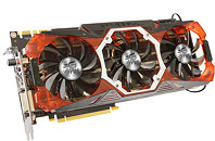
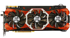
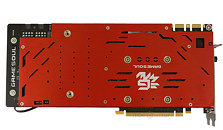
Gainward introduced the GameSoul line of premium graphics cards for the Greater China region. The series is led by the GeForce GTX 1080 GameSoul, followed by the GTX 1070 GameSoul. Both cards are based on a nearly identical board design, but differ with the PCB, with the GTX 1070 card featuring GDDR5 memory in place of GDDR5X. Both cards feature a large, triple-slot cooling solution with split aluminium fin-stacks, ventilated by a trio of 100 mm spinners.
The GTX 1080 GameSoul comes with factory-overclocked speeds of 1733 MHz core, 1873 MHz GPU Boost, against reference clock speeds of 1607/1733 MHz; while the GTX 1070 GameSoul comes with speeds of 1620/1822 MHz, against 1506/1683 MHz reference clocks. Both cards feature ref LED lighting, dual-BIOS, draw power from a pair of 8-pin PCIe power connectors, and feature display outputs of three DisplayPorts 1.4 and one each of HDMI 2.0b and dual-link DVI.
The GTX 1080 GameSoul comes with factory-overclocked speeds of 1733 MHz core, 1873 MHz GPU Boost, against reference clock speeds of 1607/1733 MHz; while the GTX 1070 GameSoul comes with speeds of 1620/1822 MHz, against 1506/1683 MHz reference clocks. Both cards feature ref LED lighting, dual-BIOS, draw power from a pair of 8-pin PCIe power connectors, and feature display outputs of three DisplayPorts 1.4 and one each of HDMI 2.0b and dual-link DVI.


29 Comments on Gainward Intros the GameSoul GeForce GTX 1080 and GTX 1070 Graphics Cards
... Just terrible.
The tackier something looks the cooler it is.
Still doesn't beat this work of art though
Not sure why a nice looking, professional card design, that also has the model on it has become obsolete, and instead they have to look like what used to happen when your overclock were too high.
But that Inno3D... the design just oozes bad choices all over the place. The top 3 fans are blocked almost half their surface for intake of air, and the side fan blows against the general direction of airflow and is of different size, so a different pitch. And in order to complete destroy aesthetics, they put a patch of red that looks like it's been in the sun too long on it as well... Someone clearly was on LSD
If everything else gets too modern/elegant for your tastes, no worries, you can always go to gpu/pc market to see awful outdated designs.
Only thing that gets a pass are nvidia reference coolers. Even After the 10 series downgrade.