 29
29
Gigabyte M34WQ Monitor Review - Gaming Meets Productivity
Response Time, Input Lag & Motion Blur »Picture Quality
The Gigabyte M34WQ features a 10-bit IPS panel capable of displaying 1.07 billion colors. The panel is in fact 8-bit, but uses Frame Rate Control (FRC), a method of temporal dithering, to create the perception of a 10-bit panel with 1,024 individual shades of RGB color. Unless you're a creative professional with an established end-to-end 10-bit color workflow, you shouldn't lose any sleep over the 8-bit+FRC nature of this monitor. The screen uses a White-LED (W-LED) backlight unit. It's controlled by direct current (DC), which makes it flicker-free at any brightness level.The screen coating on the Gigabyte M34WQ is light anti-glare (AG). The screen is exceptionally resistant to reflecting its surroundings even when used in a room with a lot of natural or artificial light, and the picture isn't perceived as grainy or dirty from a normal sitting distance, which can be the case with heavier AG coatings. The maximum specified brightness of the panel is 400 cd/m², accompanied by a static contrast ratio of 1,000:1—a common value for an IPS screen. While the maximum picture brightness in SDR mode falls a bit short of 400 cd/m², it still gets more than bright enough to deal with any surrounding reflections or glare.
To test the picture quality of the Gigabyte M34WQ, I've used a combination of the X-Rite i1Display Pro and DisplayCAL, a powerful software solution for display calibration and profiling that is completely free assuming you own a supported colorimeter.
Picture Quality at Factory Settings
The picture quality of the Gigabyte M34WQ at its factory defaults was tested right after plugging it in and allowing it to warm up for about an hour. At the factory settings, I measured brightness of 208.28 cd/m², with the color temperature sitting at 6,298 K, which isn't noticeably lower than the desired value of 6,500 K. The measured static contrast ratio was 875:1, which is to be expected with an IPS panel, and the measured gamma was sitting at an average of 2.14. Subjectively, the out-of-the-box picture quality on my sample of the M34WQ was alright, although the panel lacked brightness and punchiness in its colors. This of course is solved by playing with the OSD settings.
Without touching the OSD, the measured color accuracy is decent. The average ΔE sits at 2.04, with a single notable deviation (ΔE 5.09) when reproducing a dark shade of blue, and there are a couple of issues with some green and purple tones.
In terms of image sharpness, the picture looks very good. The native 3440x1440 resolution, when stretched over a 34-inch ultrawide panel, results in sharp fonts, icons, and other visual elements. You also get plenty of screen real estate to work with, partially because using Windows UI scaling isn't necessary. Simultaneously working in two windows side-by-side feels as if you're using two monitors, but without ugly bezels splitting the image in half.
The ultrawide panel of the M34WQ is completely flat. Most 34-inch ultrawide monitors are curved, with a mild 1800R curvature radius being the norm. The point of curvature is to prevent the vignetting effect on the screen's edges, which is due to LCD panel viewing angles, and to fill the peripheral vision more naturally. Thanks to the wide viewing angles of the IPS panel used in the M34WQ, vignetting is only slight and practically a non-issue. If you're coming from a curved monitor, especially an ultrawide one, it might take a couple of days to adjust to the flat nature of the M34WQ panel. As my daily driver is a curved 34-inch ultrawide monitor, it at first felt as though the M34WQ curves outwards because it looked very different to the panel my eyes were used to. After a while, that feeling disappeared. If I had the choice, I'd like the M34WQ's panel to be curved, but its flatness shouldn't be an issue, especially if you haven't used a curved ultrawide monitor in the past.
An obvious way to improve the out-of-the-box image quality of the Gigabyte M34WQ is to perform a hardware calibration. If you can't do so, another option is to dive into the OSD and adjust some of the available settings, which are going to improve the picture brightness and bring the color temperature closer to what we want to see. The first order of business is to fix the color temperature. This is done by stopping by the Settings > Picture submenu, where you have to select the Custom 1 profile, which gives you complete freedom to adjust the picture settings. Within that picture profile, go to Color Temperature, select User Define, and adjust the color channels. On my sample of the M34WQ, the ideal settings were Red (R) 94, Green (G) 97, Blue (B) 100. Afterward, go to Settings > Picture > Custom 1 > Brightness and adjust the picture brightness to a level you find comfortable. I usually aim for around 250 cd/m², which I find optimal for combined daytime and nighttime usage. On my sample, I had to set the Brightness option to 77 to get as close to 250 cd/m² as possible.
| Factory vs. Adjusted Settings | ||
|---|---|---|
| Factory Defaults | Adjusted Settings | |
| Measured Luminance | 208.28 cd/m² | 254.40 cd/m² |
| Measured Whitepoint | 6,298 K | 6,443 K |
| Measured Black Luminance | 0.238 cd/m² | 0.2726 cd/m² |
| Contrast | 875:1 | 933:1 |
| Gamma | 2.14 | 2.17 |
| Average Color Accuracy (ΔE) | 2.04 | 1.85 |
| Maximum ΔE | 5.09 | 5.13 |
With the aforementioned simple changes in the OSD, we've managed to adjust the brightness and color temperature to a much more comfortable level. Gamma and color accuracy also improved in the process, as did static contrast. The positive changes were easily visible even without the colorimeter, as the picture immediately looked brighter, more vibrant, and with a better overall white point and color balance.

The Gigabyte M34WQ offers six different gamma settings. It can be adjusted from 1.8 to 2.6 in 0.2 increments or, somewhat bizarrely, set to Off. According to my measurements, the gamma is best left at its default value of 2.2. While the gamma curve doesn't look perfect, it's closer to what we want to see than any other selected value. For the most part, output brightness will be very close to what's required from the input signal. Some deviation can be spotted around the 85–90% level, where the measured gamma is lower than intended, which means the picture will be brighter than necessary. That can lead to lost details in very bright scenes.

As we can see by examining the CIE diagram, we get a 99.5% coverage of the sRGB and an 85.8% coverage of the DCI-P3 color space with our adjusted settings. The gamut volume is 124.4% for sRGB and 88.1% for DCI-P3 color spaces.
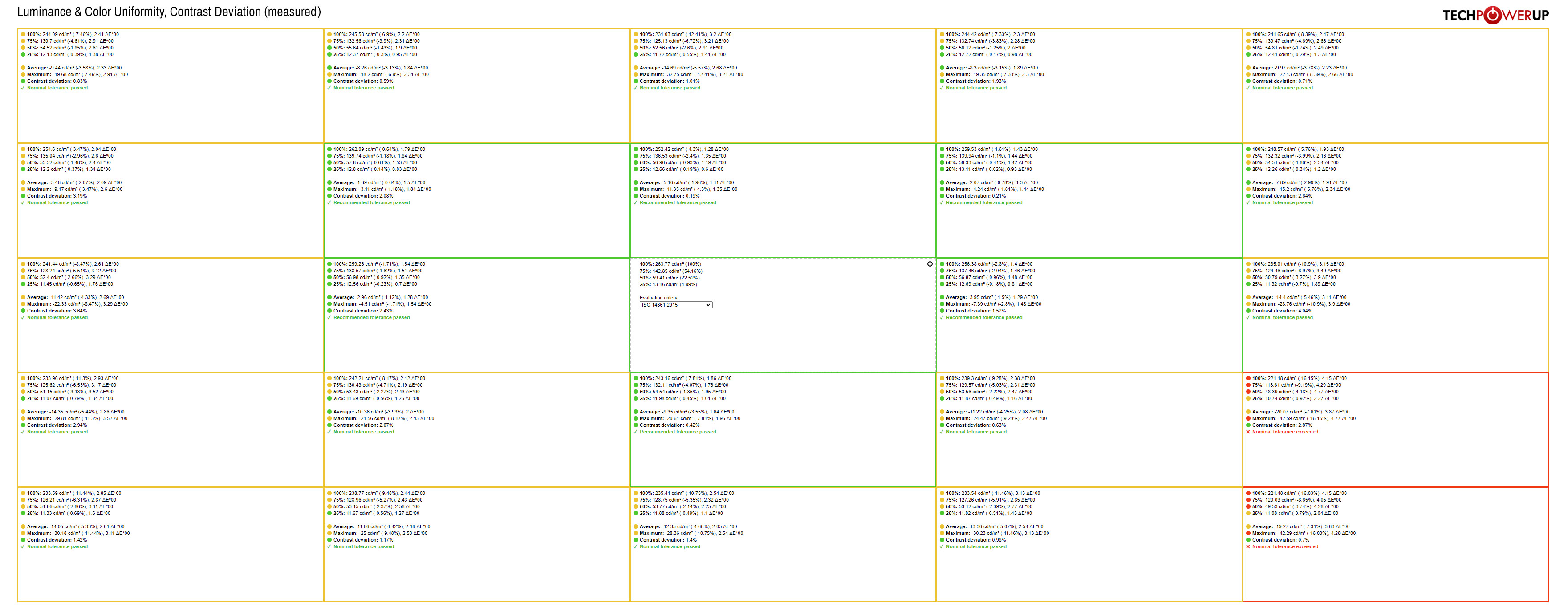
This is what the luminance and color uniformity of the Gigabyte M34WQ look like when measured at 25 different patches across the panel. Please click on the image to see it in high resolution and examine the data in greater detail. Backlight uniformity is for the most part decent, but my colorimeter picked up a rather massive -42 cd/m² drop in the bottom-right corner of the panel, exceeding the nominal tolerance of the ISO 14861:2015 evaluation criteria. That part of the panel is where I also recorded the largest deviation in color uniformity. On other parts of the panel, things look much better overall. Contrast deviation is excellent across the board as it stays below 2% on most of the panel, with the largest recorded deviation 4.04%, at middle-right edge of the panel. However, since static contrast isn't particularly high, which is an inherent drawback of most IPS panels, the Gigabyte M34WQ isn't capable of displaying exceptionally deep blacks. In dim conditions, especially during nighttime, the blacks look slightly gray. For deeper blacks and higher picture contrast, look into monitors using VA panels, or OLED monitors if perfect blacks are what you're after and you're not limited budget-wise.
Overall panel uniformity is "good enough" for gaming and most productivity tasks, but could be an issue for color-critical work. Granted, the M34WQ isn't marketed for graphics professionals anyway.
The Gigabyte M34WQ comes with a VESA DisplayHDR 400 badge, meaning it can achieve a peak luminance of 400 cd/m². This of course isn't nearly enough for a proper HDR experience. Add to that the lack of a local dimming backlight technology and this quite obviously isn't the monitor you're going to buy if you're after high-quality HDR performance.
Picture Quality After Calibration
I calibrated the display by using the X-Rite i1Display Pro colorimeter and DisplayCAL software solution. Initial profiling and calibration were done with the luminance target set to 250 cd/m², which presents a happy medium for a comfortable combined daytime and nighttime usage. The calibration was conducted with the adjusted settings listed above.Here's what we get after calibrating the Gigabyte M34WQ.
| Calibrated Performance | |
|---|---|
| Measured Luminance | 251.46 cd/m² |
| Measured Whitepoint | 6,523 K |
| Measured Black Luminance | 0.2847 cd/m² |
| Contrast | 883:1 |
| Gamma | 2.21 |
| Average Color Accuracy (ΔE) | 0.43 |
| Maximum ΔE | 1.37 |

After a hardware calibration, the Gigabyte M34WQ performs even better. We see substantial improvements in color accuracy, which now has an average ΔE of 0.43, with a measured maximum of only 1.37. These numbers are good enough for more demanding tasks, although we still can't forget about the uniformity issues in the bottom-right corner of the panel, which are going to be a dealbreaker for photo and video professionals.

Static contrast is only slightly lower, but there's a notable improvement in overall gamma accuracy, so the brightness of the picture is much more in line with the requirements of the input signal.
Backlight Uniformity
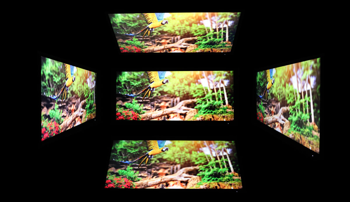
To give you an idea of the backlight's uniformity, I set the brightness of the monitor to 250 cd/m² before taking a photo of the panel in a completely dark room. I did my best to find a combination of the ISO value and shutter speed that would capture the screen in a way that has it look as close to what my eyes were seeing in real life.
Some backlight bleed can be spotted in three corners of the panel, especially in the lower left, as well as around its center. It looks worse than it is in practice, primarily because you can only spot it when viewing exceptionally dark content during nighttime.
Viewing Angles
The viewing angles of the IPS panel of the Gigabyte M34WQ are great. There's no visible shift in colors when you change your sitting position. You'll have a lot of freedom to move your head any way you like. I didn't notice any noteworthy vignetting around the edges of the screen when viewed from a normal sitting distance despite this being a completely flat 34-inch ultrawide monitor.
Jul 3rd, 2025 21:53 CDT
change timezone
Latest GPU Drivers
New Forum Posts
- [GPU-Z Test Build] New Kernel Driver, Everyone: Please Test (35)
- GPU-Z Display Bug via DP 2.1? (4)
- What Windows is overall the best to you and why? (269)
- How do you view TPU & the internet in general? (With poll) (58)
- HP Zbook 15 G2 GPU Upgrade (12)
- Will you buy a RTX 5090? (610)
- What phone you use as your daily driver? And, a discussion of them. (1756)
- What would you buy? (51)
- A Final Fantasy IX Reminiscence - My love letter and homage to one of the best stories ever told (90)
- GravityMark v1.89 GPU Benchmark (309)
Popular Reviews
- ASUS ROG Crosshair X870E Extreme Review
- Crucial T710 2 TB Review - Record-Breaking Gen 5
- Fractal Design Scape Review - Debut Done Right
- PowerColor ALPHYN AM10 Review
- Sapphire Radeon RX 9060 XT Pulse OC 16 GB Review - An Excellent Choice
- Upcoming Hardware Launches 2025 (Updated May 2025)
- AMD Ryzen 7 9800X3D Review - The Best Gaming Processor
- Sapphire Radeon RX 9070 XT Nitro+ Review - Beating NVIDIA
- SCHENKER KEY 18 Pro (E25) Review - Top-Tier Contender
- AVerMedia CamStream 4K Review
TPU on YouTube
Controversial News Posts
- Intel's Core Ultra 7 265K and 265KF CPUs Dip Below $250 (288)
- NVIDIA Grabs Market Share, AMD Loses Ground, and Intel Disappears in Latest dGPU Update (212)
- Some Intel Nova Lake CPUs Rumored to Challenge AMD's 3D V-Cache in Desktop Gaming (140)
- NVIDIA GeForce RTX 5080 SUPER Could Feature 24 GB Memory, Increased Power Limits (115)
- Microsoft Partners with AMD for Next-gen Xbox Hardware (105)
- NVIDIA Launches GeForce RTX 5050 for Desktops and Laptops, Starts at $249 (105)
- Intel "Nova Lake‑S" Series: Seven SKUs, Up to 52 Cores and 150 W TDP (100)
- NVIDIA DLSS Transformer Cuts VRAM Usage by 20% (97)