 12
12
ViewSonic ELITE XG240R 144 Hz FreeSync Monitor Review
Response Time, Input Lag & Motion Blur »Picture Quality
The ViewSonic ELITE XG240R features a 24-inch Full HD TN panel. It's a 6-bit panel that uses a technique called Frame Rate Control (FRC) to represent colors by using 8 bits of information per RGB channel. FRC is a form of temporal dithering which cycles between different color shades with each new frame to simulate an intermediate shade. Using FRC on TN panels to make them capable of displaying 16.7 million colors is standard practice, so ViewSonic didn't do anything out of the ordinary in that regard. TN panels are generally the fastest non-OLED monitor panels available, but suffer from two major drawbacks compared to IPS or VA panels: mediocre color reproduction and narrow viewing angles. We'll dissect both of those aspects of the ViewSonic ELITE XG240R below.The screen uses a White-LED (W-LED) backlight unit. It's controlled by direct current (DC). As such, it doesn't flicker regardless of the brightness setting. The screen coating is medium anti-glare (AG). The screen is very resistant to reflecting its surroundings even when used in a room with a lot of natural or artificial light, and I didn't perceive the picture as grainy or dirty from a normal sitting distance on even lighter elements.
Picture Quality at Factory Settings
Picture quality of the ViewSonic ELITE XG240R at its factory defaults was tested right after plugging it in and allowing it to warm up for about an hour. Straight out of the box, brightness is set to 100, gamma to 2.2, contrast to 70, color saturation to 50, black stabilization to 11, and Color Temperature to Native, whatever that means. Interestingly, FreeSync is turned off by default. The aforementioned combination of settings results in an underwhelming picture quality. The colors obviously lack depth and generally look unnatural and washed out. With the brightness pushed as high as it can go, no wonder that's the case. There are some color banding issues, too, especially in the black-to-white color transitions and greens. A couple of initial measurements with my trusty DataColor SpyderX quickly revealed why that's the case: at default settings, the brightness is pushed all the way up to 343 nits, and the white point is sitting at 7,474 K.
Before doing anything else, we adjust those values as close to 250 nits and 6,500 K as possible. In order to do so, we want to switch to a fully customizable picture profile. This is achieved by opening the OSD, entering the Gaming Settings menu, and selecting the Custom 1 profile. Then, we can further edit the image settings of that profile. Here are the settings I used to achieve a measured white point of 6,491 K, brightness of 249.79 nits, and gamma of 2.2. The settings which aren't mentioned in the table were left at their predefined values.
| Adjusted OSD Settings | |
|---|---|
| Color Profile | Custom 1 |
| Brightness | 64 |
| Contrast | 70 |
| Color Saturation | 50 |
| Black Stabilization | 11 |
| Gamma | 2.6 |
| Sharpness | 50 |
| Color Temperature | Full Color Control (Red 100, Green 94, Blue 91) |
| Response Time OD | Ultra Fast |
Setting the gamma value to 2.6 might strike you as odd, but there's a good reason for that: only after you set it to 2.6 in the OSD does the actual gamma measure 2.2, like it's supposed to. The OSD gamma values are way off from the actual measured ones. The offset varies from 0.3 to 0.4, and the measured gamma value is always lower than the selected one. After adjusting everything as stated in the table above, the picture quality improves dramatically. The colors look much better, richer and punchier. If you'd like to add even more vividness to them, you can increase the color saturation setting, but don't go overboard or you'll destroy the panel's ability to reproduce finer details when displaying similar shades of colors.
Let's see what the colorimeter has to say after completing the aforementioned adjustments.

As we can see by looking at the CIE diagram, we get a 98% coverage of the sRGB, 76% coverage of the Adobe RBG, 76% coverage of the DCI-P3, and 71% coverage of the NTSC color space by simply adjusting the picture settings within the OSD and without a hardware calibration of the monitor. These are good results for a TN panel. Focusing on the sRGB color space, there's a noticeable over-coverage in the greens and some slight over-coverage in the reds, although nothing too drastic and particularly noticeable to the naked eye.


The gamma curve looks decent, although there's one important thing to note—to get it to this level, you have to set the gamma value in the OSD to 2.6. If you set it to 2.2 (the value you're actually after), it will measure as 1.9, and the curve will be way off. Some micro-adjustments of the gamma curve can also be done by adjusting the Black Stabilization setting, although I wouldn't set it past 11. This, of course, isn't the marketed purpose of the Black Stabilization setting. It's there to make it easier for you to spot enemies hidden in shadows, but we know that it achieves that by adjusting the gamma curve of the monitor.
These are the measured brightness and contrast values for various brightness settings:
| Brightness and Contrast - Pre-Calibration | ||||
|---|---|---|---|---|
| Setting | Brightness | Black | Contrast | White Point |
| 0% | 88.7 | 0.14 | 620:1 | 6,300 (0,315, 0,330) |
| 25% | 155.9 | 0.23 | 680:1 | 6,300 (0,315, 0,330) |
| 50% | 224.9 | 0.33 | 690:1 | 6,400 (0,315, 0,330) |
| 75% | 295.1 | 0.41 | 710:1 | 6,400 (0,315, 0,330) |
| 100% | 362.8 | 0.50 | 730:1 | 6,400 (0,314, 0,329) |
These numbers tells us that the ViewSonic XG240R has a working brightness range of 88.7–362.8 nits, which should suffice for any scenario this monitor is meant for. Actual brightness doesn't change on a linear scale, meaning setting it to 100% won't result in a picture that is twice as bright as the one where the brightness was set to 50% in the OSD. The contrast ratio is mediocre for even a TN panel.


Color uniformity varies from solid to quite poor depending on the brightness level of whatever is shown on screen. The brighter the objects, the less noticeable and measurable the deviation; ∆E doesn't go above 4.5 (lower-left corner of the screen). Things take a sharp turn for the worse at less brightness, where ∆E on the entire upper third of the panel varies from 6.2 to 7.5, which is the highest deviation I have measured in months. Oddly enough, the middle and bottom of the screen fare quite well in terms of uniformity; ∆E measures between 1.1 and 3. While the massive ∆E deviation on the upper third of the panel won't necessarily bother you while gaming, especially if the game you're playing is fast-paced, the color uniformity of my sample of the ViewSonic XG240R can only be described as underwhelming.


Luminance uniformity is again highly dependent on the brightness. At higher brightness levels (around 250 nits), the left third of the screen is 11% darker than the middle. This deviation is very hard to spot with the naked eye. However, with brightness at 50 nits, the left third of the screen becomes up to 20% darker than the right third.

With an average ∆E of 3.84, the color accuracy of the ViewSonic XG240R is acceptable considering this is a TN panel we're talking about. There are certain colors it handles very well, such as reds, yellows, and greens, and some it struggles with, such as various shades of gray and cyan. This can be improved by doing a proper hardware calibration.
Picture Quality After Calibration
I calibrated the display by using the Datacolor SpyderX. My targets were 250 nits of brightness and a color temperature of 6,500 K. Let's take a look at the post-calibration report:| Post-Calibration Report | ||
|---|---|---|
| Brightness (Candelas) | Black | White |
| Uncalibrated | 0.38 | 253.3 |
| Target | 0.35 | 250.0 |
| Calibrated | 0.35 | 250.3 |
| White Point (CIE xy) | ||
| Uncalibrated | 0.318 | 0.329 |
| Target | 0.313 | 0.329 |
| Calibrated | 0.314 | 0.329 |
| Primaries (CIE xy) | ||
| Red | 0.646 | 0.328 |
| Green | 0.312 | 0.621 |
| Blue | 0.155 | 0.069 |
| Delta-E (Lab) | ||
| White Point | 0.7 | |
| 50% Gray | 0.2 | |
| Gamma | ||
| Uncalibrated | 2.03 (0.21) | |
| Target | 2.20 (0.00) | |
| Calibrated | 2.23 (0.00) | |
The calibration resulted in deeper, more impactful and natural colors with smoother gradients. This was particularly noticeable in the blues, which were quite problematic before calibration. Here's the ICC profile (download here) that was generated after calibrating the monitor.
Backlight Uniformity
To give you an idea of the backlight's uniformity, brightness was set to 120 and 250 nits before I took photos in a completely dark room. I did my best to find a combination of the ISO value and shutter speed that would capture the screen in a way that has it look as close to what my eyes were seeing in real life.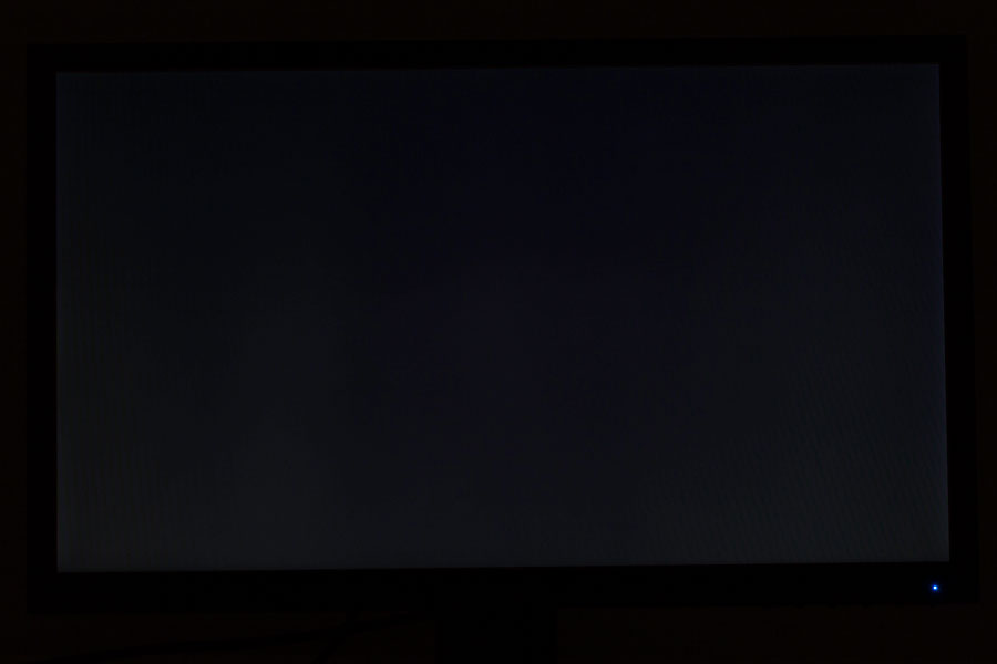
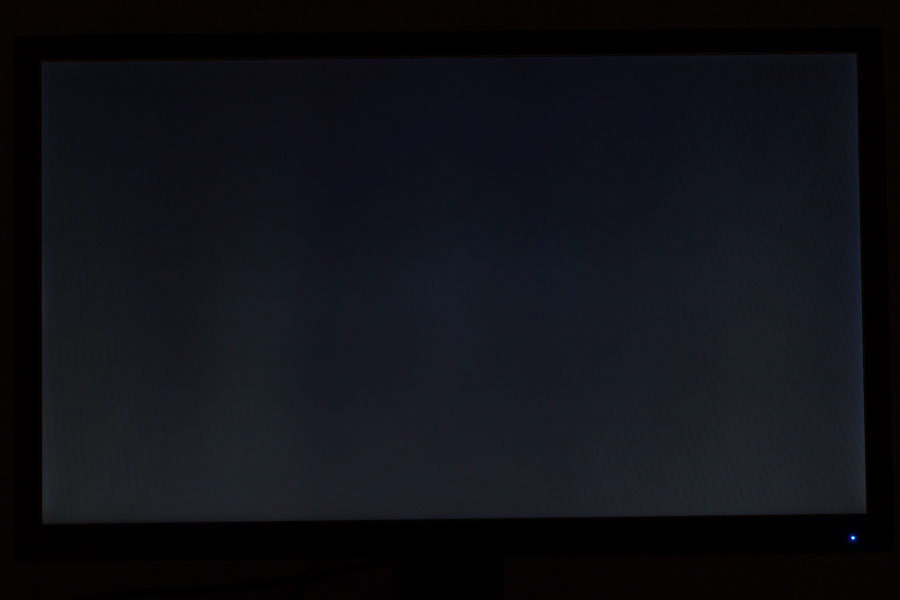
There's some significant visible backlight bleed on the entire bottom half of the panel, particularly on the left and right edge. Things do look better at 120 nits, but most users will want to have the brightness set much closer to 250 nits (second photo) or even higher. While this issue didn't strike me as problematic while playing brighter games, the backlight bleed was visible when I was watching movies (especially those with top and bottom black bars) or playing darker video games. On monitors like this one, the backlight implementation can vastly differ on a per-sample basis, so your mileage may vary. I can of course only show you the sample I was provided with.
Viewing Angles
This being a TN panel, the viewing angles aren't great. There's a substantial color shift, especially in the vertical direction, when you change your sitting position. As with any other TN monitor, you'll want to sit in a way that has your head level with the center of the screen to avoid any issues related to viewing angles. The good news is that the fully adjustable stand of the ViewSonic XG240R lets you set the screen to pretty much any position you might find suitable.
Jul 12th, 2025 01:15 CDT
change timezone
Latest GPU Drivers
New Forum Posts
- Will you buy a RTX 5090? (642)
- 'NVIDIA App' not usable offline? (8)
- Can you guess Which game it is? (222)
- What are you playing? (23920)
- RX 9070 XT freezing/locking up only on desktop, anyone else? (43)
- NVIDIA RTX PRO 6000 Workstation Runs Much Hotter Than 5090 FE (22)
- Quick charging your USB devicesUSB 3.2 Gen 2x2 Type-C® front-panel. (1)
- GTX 1050 GPU Owners Club (12)
- ASUS ProArt GeForce RTX 4060 Ti OC Edition 16GB GDDR6 Gaming - nvflash64 VBIOS mismatch (2)
- No offense, here are some things that bother me about your understanding of fans. (33)
Popular Reviews
- Fractal Design Epoch RGB TG Review
- Corsair FRAME 5000D RS Review
- Lexar NM1090 Pro 4 TB Review
- NVIDIA GeForce RTX 5050 8 GB Review
- NZXT N9 X870E Review
- Sapphire Radeon RX 9060 XT Pulse OC 16 GB Review - An Excellent Choice
- AMD Ryzen 7 9800X3D Review - The Best Gaming Processor
- Upcoming Hardware Launches 2025 (Updated May 2025)
- Our Visit to the Hunter Super Computer
- Chieftec Iceberg 360 Review
TPU on YouTube
Controversial News Posts
- Intel's Core Ultra 7 265K and 265KF CPUs Dip Below $250 (288)
- Some Intel Nova Lake CPUs Rumored to Challenge AMD's 3D V-Cache in Desktop Gaming (140)
- AMD Radeon RX 9070 XT Gains 9% Performance at 1440p with Latest Driver, Beats RTX 5070 Ti (131)
- NVIDIA Launches GeForce RTX 5050 for Desktops and Laptops, Starts at $249 (119)
- NVIDIA GeForce RTX 5080 SUPER Could Feature 24 GB Memory, Increased Power Limits (115)
- Microsoft Partners with AMD for Next-gen Xbox Hardware (105)
- Intel "Nova Lake‑S" Series: Seven SKUs, Up to 52 Cores and 150 W TDP (100)
- NVIDIA DLSS Transformer Cuts VRAM Usage by 20% (97)