 2
2
SteelSeries APEX M800 Keyboard Review
Closer Examination »Packaging

The packaging for the SteelSeries APEX M800 follows the same color scheme and theme as their other products - a rather large picture of the keyboard on front shows us what we are buying, and a splash of color gives it its readily apparent SteelSeries brand identity.
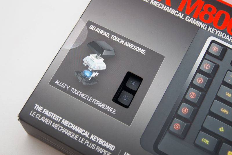
One feature we don't often see is an area where you can check to see what a keyboard's switches feel like, and with the APEX M800, we have a small area where we can feel just how the SteelSeries QS1 switch feels, which is great as these switches will be a new experience for a lot of users.

On the rear of the box is a lot of information on the new QS1 switch, as well as a description of some of its illumination options. It also showcases the Fnatic and NAVI logos, two huge eSports teams that are affiliated with SteelSeries.

On the side of the box are a few pictures of the product. To me, the most interesting one was this view that shows us just how low a profile the keys on this keyboard have. Also take note of what looks like silver plastic in this picture; actually clear plastic, the RGB LEDs shining through these endow them with a striking effect whilst the keyboard is in use.
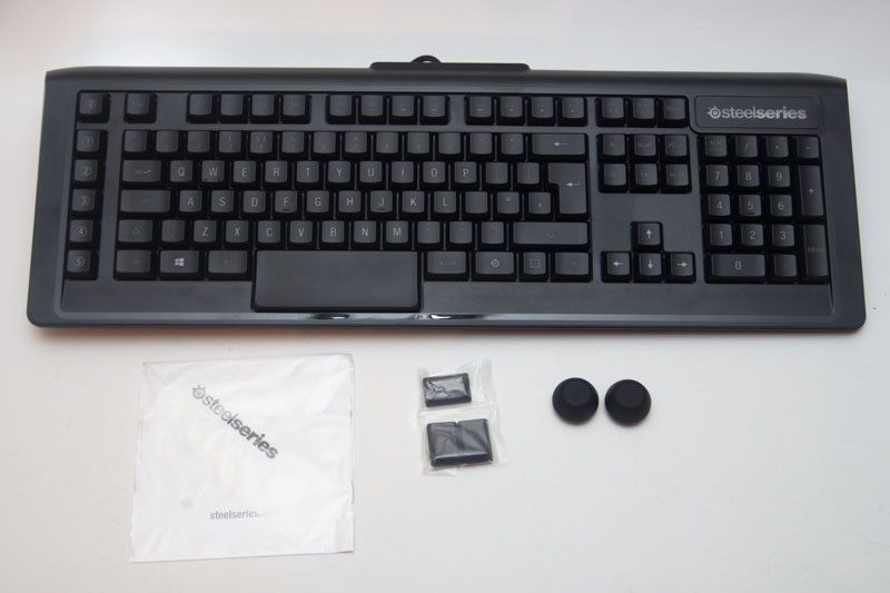
Inside the box, we have the keyboard, some extra keycaps, some large rubber feet, a manual, and a SteelSeries sticker.
Jul 10th, 2025 13:02 CDT
change timezone
Latest GPU Drivers
New Forum Posts
- Recommend me a decent budget card :) (29)
- [GPU-Z Test Build] New Kernel Driver, Everyone: Please Test (80)
- Ryzen 9 7950x idles at 55/60C (37)
- Swapping existing router w/ a replacement; any issues? (3)
- Legion 7 16IRX9 (5)
- Looking for a new m.2 drive that is suitable for livestreams, multi browsing, easy encoding/rendering, NOT gaming! Budget: €300 (29)
- Best motherboards for XP gaming (70)
- Request for RX 7000 and 9000 GPUs to test artefacting video (7)
- RX 9070 XT freezing/locking up only on desktop, anyone else? (33)
- Amazon Prime days sale (2)
Popular Reviews
- NZXT N9 X870E Review
- Fractal Design Epoch RGB TG Review
- NVIDIA GeForce RTX 5050 8 GB Review
- Corsair FRAME 5000D RS Review
- Fractal Design Scape Review - Debut Done Right
- Sapphire Radeon RX 9060 XT Pulse OC 16 GB Review - An Excellent Choice
- AMD Ryzen 7 9800X3D Review - The Best Gaming Processor
- Upcoming Hardware Launches 2025 (Updated May 2025)
- Sapphire Radeon RX 9070 XT Nitro+ Review - Beating NVIDIA
- PowerColor ALPHYN AM10 Review
TPU on YouTube
Controversial News Posts
- Intel's Core Ultra 7 265K and 265KF CPUs Dip Below $250 (288)
- Some Intel Nova Lake CPUs Rumored to Challenge AMD's 3D V-Cache in Desktop Gaming (140)
- AMD Radeon RX 9070 XT Gains 9% Performance at 1440p with Latest Driver, Beats RTX 5070 Ti (118)
- NVIDIA Launches GeForce RTX 5050 for Desktops and Laptops, Starts at $249 (118)
- NVIDIA GeForce RTX 5080 SUPER Could Feature 24 GB Memory, Increased Power Limits (115)
- Microsoft Partners with AMD for Next-gen Xbox Hardware (105)
- Intel "Nova Lake‑S" Series: Seven SKUs, Up to 52 Cores and 150 W TDP (100)
- NVIDIA DLSS Transformer Cuts VRAM Usage by 20% (97)