Wednesday, February 8th 2012

Windows 8 Consumer Preview Inbound for MWC

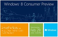
On the sidelines of mobile computing's biggest annual international event, the Mobile World Congress (MWC), held in the end of February, Microsoft will hold a special event, titled Windows 8 Consumer Preview. The company sent out invites to the event, to its industry partners. The event will be held on the 29th of this month, and will be a two hour event in late-afternoon (3 PM - 5 PM). The synchrony of this event with MWC speaks volumes about the direction in which Microsoft is steering its OS business. Microsoft clearly wants to go big on operating systems for portable computing devices, and as such is converging this kind of OS with those for more powerful PCs. The convergence will at first be functional (similar UI, some inter-compatibility), and later structural (Windows-on-Windows ARM)?
Sources: Engadget, ZDNet
Add your own comment

9 Comments on Windows 8 Consumer Preview Inbound for MWC

#1
Frick
Fishfaced Nincompoop
I really wish I had a tablet by now. :(
Posted on Reply
#3
btarunr
Editor & Senior Moderator
Yup, the way the interface is shaping up, either we'll see Windows 7 become the next Windows XP (people hold on to it for a decade), or we'll see swarms of users dump Windows for Linux Apple MacOS (buy Macs).

I don't the get the point in the whole "Metro" UI design, it looks like a training program for chimps (push the right color for banana).
Posted on Reply
#4
Frick
Fishfaced Nincompoop
btarunrI don't the get the point in the whole "Metro" UI design, it looks like a training program for chimps (push the right color for banana).
Again I think it's good for the touch screens. And they will continue to push for Windows Everywhere and they need an interface that works on mobiles, tablets and TV's. And for that Metro is pretty good. For a desktop maybe not.
Posted on Reply
#5
Depth
The Metro is designed for tablets. HUGE user interface easy to use with a touch screen and large slide buttons for fat thumbs.

Way redundant on desktops, especially since you can't turn it off. You can do a registry edit to castrate the bloody thing but that makes other important functions fail.
Posted on Reply
#6
pantherx12
DepthThe Metro is designed for tablets. HUGE user interface easy to use with a touch screen and large slide buttons for fat thumbs.

Way redundant on desktops, especially since you can't turn it off. You can do a registry edit to castrate the bloody thing but that makes other important functions fail.
The version everyone uses at the moment isn't even a RC, a toggle switch may still be added, hell it may even not be on as default for desktops.

It's a developer preview so new features are going to be front and centre as that's the stuff developers need to see, since they can undoubtedly already make products based around the traditional windows UI.
Posted on Reply
#7
Depth
I hope you're right.
Posted on Reply
#8
btarunr
Editor & Senior Moderator
DepthThe Metro is designed for tablets. HUGE user interface easy to use with a touch screen and large slide buttons for fat thumbs.
Well I wouldn't have minded if they just made the icons bigger, instead of those big uni-color squares/rectangles. That's just bad use of screen space.
Posted on Reply
#9
v12dock
Block Caption of Rainey Street
Kernel tweaks and a new file system and I am sold
Posted on Reply
Nov 27th, 2024 08:45 EST change timezone

New Forum Posts

Popular Reviews

Controversial News Posts