Saturday, May 19th 2012

Latest Windows 8 Screenshots Reveal Ouster of Aero Glass UI
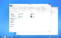
In June, Microsoft will unveil the first Release Preview of Windows 8, its next major version of the Windows (client). Some of the latest screenshots of the teething operating system made it to the web, and reveal some significant changes to the UI, apart from the Metro UI. With its Desktop workspace, Windows 8 embraces a new UI design, that does away with the glassy Aero design that was introduced with Windows Vista. What we have instead, are minimalist titlebars with centered window titles, flat window control buttons, and a blending of the titlebar's color with that of the other menubars. Microsoft justifies the design change by calling the older Aero UI "dated and cheesy." Microsoft assured users that it will assist in the transition between the two UIs, apart from the major change that Metro is.
Sources:
MSDN Blogs, Engadget

83 Comments on Latest Windows 8 Screenshots Reveal Ouster of Aero Glass UI
also metro feels like you're eating at mcdonalds or BK barebones, rigid, and budget
and aero glass feels more like you're eating at LongHorn Steakhouse or your local equivalent. classy, comfy, and friendly
Looks amateur and unfinished.
In Office 2003 it took me... Maybe 20 minutes to get completely accustomed to each piece of software, Office 2010? Took me 20 minutes to import outlook data. (okay maybe I'm exaggerating there a bit) But in general seriously, the OS is a "tool" nothing else, leave it as such. Constant changes this drastic are driving your customers to APPLE. :rolleyes:
I'm going to laugh so hard when Android takes out Windows in 10 years.
PS- sold my MS stock a long time ago :D