Saturday, May 19th 2012

Latest Windows 8 Screenshots Reveal Ouster of Aero Glass UI
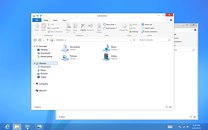
In June, Microsoft will unveil the first Release Preview of Windows 8, its next major version of the Windows (client). Some of the latest screenshots of the teething operating system made it to the web, and reveal some significant changes to the UI, apart from the Metro UI. With its Desktop workspace, Windows 8 embraces a new UI design, that does away with the glassy Aero design that was introduced with Windows Vista. What we have instead, are minimalist titlebars with centered window titles, flat window control buttons, and a blending of the titlebar's color with that of the other menubars. Microsoft justifies the design change by calling the older Aero UI "dated and cheesy." Microsoft assured users that it will assist in the transition between the two UIs, apart from the major change that Metro is.
Sources:
MSDN Blogs, Engadget

83 Comments on Latest Windows 8 Screenshots Reveal Ouster of Aero Glass UI
If the Classic Desktop, with Aero, and the ability for the end-user to completely disable the Immersive UI (Metro) and the Windows Store (the real reason for Windows 8 existence), I will not even bother downloading a copy from my Technet account.
The Aero UI looks like the slightly cutesy OSX UI to me.
Then again when you have something good like win 7 why bother changing?
lol MS needs to just focus on windows 7. There is nothing wrong with windows 7 and it works perfectly fine with pretty much anything.
it shouldnt call it new interface, and why dont they listen to us to at least give an option to put start menu on the front than using metro that makes your pc feels like phone?
I will wait until 8 is released and most likely upgrade anyway as from what I have noticed is tht it's slightly faster than 7 and uses less RAM which is always a plus.
We know you can disable metro and tbh how many people really benefit from aero? I do use aero peek to switch IE tabs aside from that it has no benefits. Also having settings more accessible for average users isn't a bad thing is it?
Tablets.
now in many words, the new ribbon as its called makes doing certain tasks on a tablet soo much easier although it will eat up some screen space but its better than ha ing to bring up a virtual kb every time
as for removing the glass look, its less demanding on tablets (remember theyre making an arm version of windows too)
as for the start menu... dont really need it anymore since you can get to you libraries from the quicklaunch on the taskbar, and any other apps can have shortcuts made into "toolbars" on the taskbar as well
However I've mostly been sticking to server releases and I've found them to be much better then the consumer releases.
Instead of xp I used 2003, instead of vista I used 2008, and instead of 7 I used 2008R2.