Tuesday, August 27th 2013

Microsoft Windows 8.1 Goes RTM
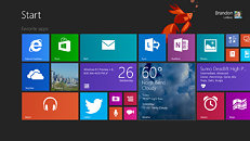
Today, via a Blogging Windows post, Microsoft has confirmed that both Windows 8.1 and Windows RT 8.1 have reached the RTM (release to manufacturing) milestone. This Windows version brings back the Start button and also features Internet Explorer 11, SkyDrive integration, an updated Windows Store experience, DPI scaling improvements (enabling better readability on high-DPI displays), 3D printing support, more customization options, tweaked mouse and keyboard navigation, and a boot-to-desktop option.
Windows 8.1 will become available (to business customers, consumers, as well as MSDN and TechNet subscribers) on October 18th.
Windows 8.1 will become available (to business customers, consumers, as well as MSDN and TechNet subscribers) on October 18th.

83 Comments on Microsoft Windows 8.1 Goes RTM
semiaccurate.com/2012/11/27/microsofts-problems-another-data-point/
The only things I'm really looking forward to is the improved search and the ability to get rid of that ugly metro background and have it use just my desktop wallpaper.
Wonder if I can get an RTM download.
On the bright side ZDnet claims a source says that they have finally gotten the "quality metrics" for Windows 8.1 back in line with Windows 7, so there will be fewer crashes and system hangs.
Besides, if the average person actually cared about the recent news relating to the NSA and PRISM, then Apple would have a problem convincing people to use iCloud.
7 for me until they listen.
Is what they claim, better search, really better? I have delayed an OS change for months, in anticipation of an improvement to WIN8.
Have I wasted my time? Can I, Should I, continue to wait for this?
Fortunately, I tend to be lazy on upgrades, or I would be really freaking out about this. As it is, it does seem like the release date has been pushed back a few times. Is there any reason to believe them, this time?
I moved from Win7Pro to Win8 Pro a couple weeks ago and I am overall pleased with performance and the updated look on the desktop, but I don't use any of the 'extra' features. I just go straight to my desktop where it pretty much functions exactly as 7 did.
Tablet, W8 pro, W8 Gamer and W8 Ultimate (where u pile all the crap you don't want).
Everything I use most is right in my start menu, and able to be selected with my mouse in a much smaller, and faster to navigate, area. It is faster and more efficient for me. I spent 3 months on 8 trying to get used to it, and I am just plain faster at using 7, period.
This is the case for many people, thus the outcry for the return of the function. It has nothing to do with getting used to change, it has everything to do with efficiency within our limitations.
Now, on a touch screen, the Start Screen is amazing, and 8 really comes into it's own. I choose 8 every time on anything with touch capability. It's leagues ahead of 7 in that respect.