Tuesday, August 27th 2013

Microsoft Windows 8.1 Goes RTM
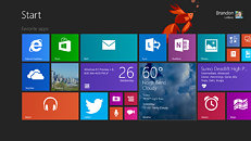
Today, via a Blogging Windows post, Microsoft has confirmed that both Windows 8.1 and Windows RT 8.1 have reached the RTM (release to manufacturing) milestone. This Windows version brings back the Start button and also features Internet Explorer 11, SkyDrive integration, an updated Windows Store experience, DPI scaling improvements (enabling better readability on high-DPI displays), 3D printing support, more customization options, tweaked mouse and keyboard navigation, and a boot-to-desktop option.
Windows 8.1 will become available (to business customers, consumers, as well as MSDN and TechNet subscribers) on October 18th.
Windows 8.1 will become available (to business customers, consumers, as well as MSDN and TechNet subscribers) on October 18th.

83 Comments on Microsoft Windows 8.1 Goes RTM
What they should have done is kept the Start button and menu by default when a PS2/USB mouse is plugged in and have the Start Screen set by default when a digitizer/touch screen/tablet PC is detected. That would've made a lot more sense and lessened the initial reaction from the PC users.
Screw the NSA.
And besides in windows 8.1, the start can open up on top of the desktop, so you can still see your desktop (perhaps even more of it) in the background while you navigate through start.Yes.
Shady bitches working out shady collaborations...
"Because you have to move further to click things on the Start screen."
You have a scroll on your mouse right? You can scroll right to any app you want.
"I don't have to rifle through folders in my Start Menu."
Who does?
"Everything I use the most is there as soon as I click the button"
In windows 8 everything I use is there as soon as I go to start too and IDK about you but since vista I've just been using the search bar to get to absolutely anything I want by usually typing the first three letters of it.
"takes up about 1/8 of my screen. That's much less area to cover, and I am faster for it."
Using up 100% of the screen and scrolling through things covers more things using more space to show you your things and is probably as fast if not faster.
"I don't need more room to view things, I need more things in less room."
This is just preference with no inherit merit. Sounds like an argument just for the sake of arguing.
I don't' care what OS anyone uses and I find criticism is good, but I just don't understand some of the dislikes people are tossing at Win 8. Some comments seem to just stem from people being stubborn rather than some actual issue with Win 8 (no offense to anyone in regards to this comment).
I am not a touch typist. Typing the letters of programs is not faster for me.
Moving my mouse in a tiny little corner of my screen is much faster than scrolling through my programs or moving across the entire screen to get what I am after. For me, this is a fact. There is no disputing it. It just does not work as well for me. I am far more accurate and use less movement with the start menu, period.
And preference for something that works better with your working style is it's own merit. Because it doesn't work well with yours does not mean that mine lacks merit.
I am not the only one that works best this way, otherwise the outcry for the start menu would have died down by now. It hasn't. People still want it, and they want it because they work better with it.
This is not a matter of adjustment or resistance to change for me, it's a matter of inefficiency in relation to my working style. I have happily adopted every previous change to the start menu before this. Once I adjusted to it, I found it worked just as well, if not better for me, than the previous versions. But, no amount of adjustment made start screen match or better the menu for me. I don't mind alternative UIs, as long as they work well with me. I even adjusted to, and work well in OS X and like it. That just isn't the case here.
I am glad it works for you, but Win 8's UI does not work well with me (and many, many others), period.
I could go on endlessly against the claims of decreased functionality by lack of a button and increased start menu size but I'm not a Microsoft PR so before I strike any more chords, I'll leave this one to you.