Tuesday, May 24th 2022

MSI Gaming Reveals New Symbols to Identify the New MEG, MPG, and MAG Series
MSI breaks down its gaming products (Desktop/Monitor/Motherboard/PC Components) into three different segments, which are the MEG series, MPG series, and MAG series, to position the products in the market precisely and to satisfy the needs of different gamers. During the past few years, we have developed many products under these series and shared fascinating designs with gamers around the world. Now we are delighted to reveal graphical symbols designed for each series. The added symbols will not only generate a new visual identity but also clearly define each series. More specifically, with the involvement of new symbols, the new looks of the MEG, MPG, and MAG series will also be presented to gamers.
From early 2023, gamers will see the graphics being applied to gaming motherboards, gaming desktops, gaming monitors, gaming chairs, cases, power supplies, and liquid coolers. With our new symbols, we have defined the design languages of each series and planned to make the products look like they belong in the same family.

 New symbol design and the identity of the MEG, MPG, and MAG series
Ever since we positioned our gaming products in MEG, MPG, and MAG series, we have been implementing various design styles on each series to satisfy different preferences. As our product lines expand quickly, we recognize the importance of delivering clear messages and better defined stories of each series to respond to a growing size of audience. Hence, with the start of adding new graphical symbols to each series, we expand the story of each series and bring out fresher looks to accommodate different gamers.
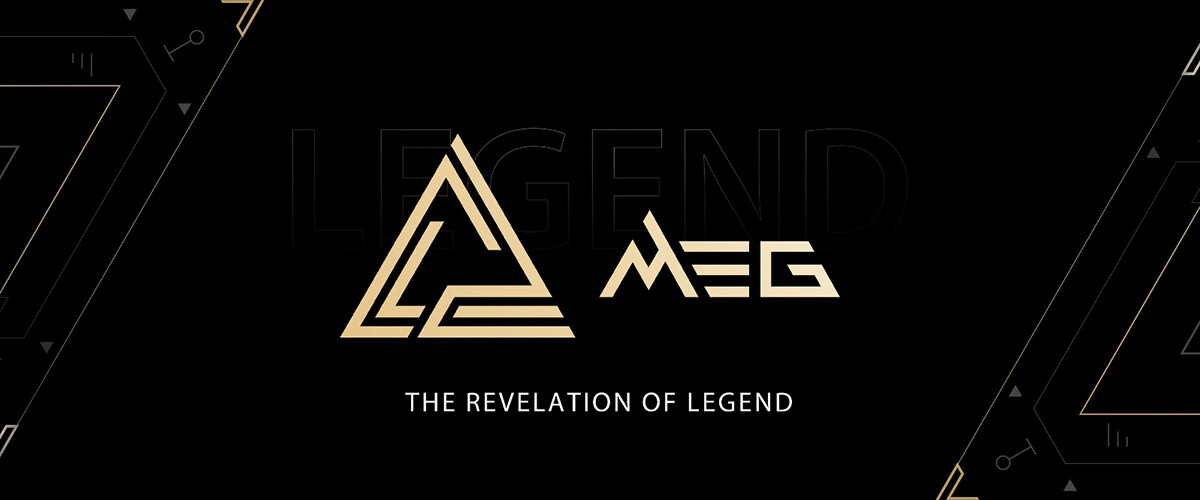
The MEG Series: For enthusiasts who pursue a transcendent gaming experience
As our flagship series, the MEG series have been committed to achieving ultimate aesthetics and providing exceptional performance to serve those who pursue peak gaming experience. For a long time, the MEG series has been designed to set the highest standard of gaming products and consists of masterpieces worth collecting. The new MEG symbol maintains the core concept of presenting the best aesthetics and pushes the series further by carrying a new story.
Combined with the iconic MEG triangle, the design of the MEG symbol takes the concept of mysterious runes from ancient civilizations to outline the power and elegance of the MEG series. With the symbol, the MEG series reinforces the determination to always stand at the peak and become a gaming legend who will conquer all challenges. For gamers who pursue the best gaming experience, the MEG series will keep delivering stunning designs and producing products that go beyond everyone's expectations.
The MPG Series: For those who enjoy outstanding performance with a desire to show their unique style
The MPG series has attracted a lot of followers because of its outstanding performance and the unique design style. To respond to an increasing numbers of gamers who embrace fashion trends with an ambition to express their distinct personalities, we decided to amplify the style of MPG. Consequently, as we release the new MPG symbol, now the "performance" in MSI Performance Gaming series not only means that we provide gamers with powerful systems, but it also suggests that we attempt to fascinate the gaming world by showing stunning and memorable styles.
The new symbol is designed to be trendy with more popular elements, including street style, pop, mix and match style, with more to join the MPG series design later on. Namely, in addition to our stunning and advanced RGB light control, we are well-prepared to demonstrate more splendid design concepts for our new MPG series products. By applying these fantastic ideas, we will create more distinctive designs that captivate the audience at first glance.
The MAG Series: A younger series which provides gamers exceptional experience with stable and durable products
The MAG series had been embraced by gamers due to its uncompromised durability and stability. During the past few years, benefiting from the complete product line and tough design image, the MAG series attracted a group of fans who are into military-inspired designs. To satisfy a more diverse audience inclusive of a younger group of gamers, we decided to give MAG a fresher and brighter look. To be more specific, besides the highlighted series characteristics of reliability and stability, we added a new MAG symbol to the series that depicts the concept of unity. Moreover, we introduced a new color to enrich the tone of the MAG series to make the series more energetic and passionate. By presenting a younger look, we want to recruit more players to the series and build a deeper connection with them. In the future, the fans of the MAG series can still see their beloved military elements on all MAG products, yet, with a fresher and better look. The core that would never change is the quality and reliability of MAG products as well as our determination to stand alongside the gamers.
Future Expectations
There is no doubt that the MEG series, MPG series, and MAG series will keep producing gaming products of high quality. Gamers can expect more intriguing designs and stories to come. Launching new symbols is just the beginning. We are going to enrich each series by presenting distinctive characteristics and demonstrating a family look on the overall design. By doing so, we can meet the needs and various preferences of different groups of gamers and ensure gamers can always find a sense of belonging with MSI products.
From early 2023, gamers will see the graphics being applied to gaming motherboards, gaming desktops, gaming monitors, gaming chairs, cases, power supplies, and liquid coolers. With our new symbols, we have defined the design languages of each series and planned to make the products look like they belong in the same family.


Ever since we positioned our gaming products in MEG, MPG, and MAG series, we have been implementing various design styles on each series to satisfy different preferences. As our product lines expand quickly, we recognize the importance of delivering clear messages and better defined stories of each series to respond to a growing size of audience. Hence, with the start of adding new graphical symbols to each series, we expand the story of each series and bring out fresher looks to accommodate different gamers.
The MEG Series: For enthusiasts who pursue a transcendent gaming experience
As our flagship series, the MEG series have been committed to achieving ultimate aesthetics and providing exceptional performance to serve those who pursue peak gaming experience. For a long time, the MEG series has been designed to set the highest standard of gaming products and consists of masterpieces worth collecting. The new MEG symbol maintains the core concept of presenting the best aesthetics and pushes the series further by carrying a new story.
Combined with the iconic MEG triangle, the design of the MEG symbol takes the concept of mysterious runes from ancient civilizations to outline the power and elegance of the MEG series. With the symbol, the MEG series reinforces the determination to always stand at the peak and become a gaming legend who will conquer all challenges. For gamers who pursue the best gaming experience, the MEG series will keep delivering stunning designs and producing products that go beyond everyone's expectations.
The MPG Series: For those who enjoy outstanding performance with a desire to show their unique style
The MPG series has attracted a lot of followers because of its outstanding performance and the unique design style. To respond to an increasing numbers of gamers who embrace fashion trends with an ambition to express their distinct personalities, we decided to amplify the style of MPG. Consequently, as we release the new MPG symbol, now the "performance" in MSI Performance Gaming series not only means that we provide gamers with powerful systems, but it also suggests that we attempt to fascinate the gaming world by showing stunning and memorable styles.
The new symbol is designed to be trendy with more popular elements, including street style, pop, mix and match style, with more to join the MPG series design later on. Namely, in addition to our stunning and advanced RGB light control, we are well-prepared to demonstrate more splendid design concepts for our new MPG series products. By applying these fantastic ideas, we will create more distinctive designs that captivate the audience at first glance.
The MAG Series: A younger series which provides gamers exceptional experience with stable and durable products
The MAG series had been embraced by gamers due to its uncompromised durability and stability. During the past few years, benefiting from the complete product line and tough design image, the MAG series attracted a group of fans who are into military-inspired designs. To satisfy a more diverse audience inclusive of a younger group of gamers, we decided to give MAG a fresher and brighter look. To be more specific, besides the highlighted series characteristics of reliability and stability, we added a new MAG symbol to the series that depicts the concept of unity. Moreover, we introduced a new color to enrich the tone of the MAG series to make the series more energetic and passionate. By presenting a younger look, we want to recruit more players to the series and build a deeper connection with them. In the future, the fans of the MAG series can still see their beloved military elements on all MAG products, yet, with a fresher and better look. The core that would never change is the quality and reliability of MAG products as well as our determination to stand alongside the gamers.
Future Expectations
There is no doubt that the MEG series, MPG series, and MAG series will keep producing gaming products of high quality. Gamers can expect more intriguing designs and stories to come. Launching new symbols is just the beginning. We are going to enrich each series by presenting distinctive characteristics and demonstrating a family look on the overall design. By doing so, we can meet the needs and various preferences of different groups of gamers and ensure gamers can always find a sense of belonging with MSI products.
11 Comments on MSI Gaming Reveals New Symbols to Identify the New MEG, MPG, and MAG Series
its hard to figure out on whether which one has the budget boards or which ones are the mainstreams.
Always needing for an indepth look just to shortlist ur favorite boards range is kinda annoying.
I should know, I worked for them for a while and we tried to make something that made sense and were shot down by HQ in Taiwan.
Admittedly that is almost 20 years ago now, but nothing seems to have changed. Shit I'm old...
The boards look fine and I kind of like the new logos, but why stick that dragon on top of those geometric designs?
It's probably just my pet peeve, but somehow I feel like they are not taking me seriously as a customer with that cliché tribal-looking design. :rolleyes:Ah, didn't look at it from that perspective. I guess the design language can make more sense in that context. Still, it's not for me.
I know that vanity should not get in the way too much when it comes to spending hundreds of moneys on hardware that should be good value.
However, I personally do often exclude MSI dragons from my list of options unless I'm completely sure I don't have to look at them.
Also, what's that commie-sounding "Unite as one" thing under the MAG brand? Who have I got to unite with? :wtf:
Anything for sales eh, I mean that pink MPG 'popping style' is clearly for the LGBTHQABCDEF crowd and MEG is just for everyone else, I guess.
Self confirmation bias is a thing these days, especially among 'critical thinkers'. The irony :D
Anyway, I think they do a terrible job. Using abstract symbols just doesn't make sense. If they're going to use symbols, they should at least coincide with the product line. Imo, they would've been fine just using the name with that font style and simply ditching the symbol since the MEG, MPG, MAG in that style would easily serve a dual purpose of naming & acting as a symbol.