Sunday, January 27th 2019

ChromeOS-competitor Windows Lite to Feature a Reimagined UI, Chucks "Metro" Live Tiles

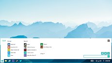
Windows Lite is a new upcoming PC operating system by Microsoft designed as a competitor to Google's ChromeOS, and being designed for machines with extremely slim hardware specifications. The OS could also target devices that work as "edge computers," with much of their processing being performed over the cloud. ChromeOS beats the bloated Windows 10 in one key department - a lightweight and uncluttered user-interface. This is the area where much of Microsoft's design efforts lie - UI elements and graphics that are lightweight not just on memory, but also Internet bandwidth, if the device is streaming a remote session (a la Citrix). Below is a concept by UX designer Jay Machalani.

The Windows Lite desktop looks familiar, with a taskbar and app buttons, and a Start menu, but one that's been redesigned without live tiles, but a simple list of icons. At this point it's unclear just how far Microsoft intends to go with the lightweight OS concept without cannibalizing sales of Windows 10 Home. The OS definitely features UWP, and from the looks of the screenshot doing rounds, also appears to support legacy Win32 apps, however, Microsoft has in the past restricted functionality of its cheapest OS products so as to not kill pricier Windows versions. Microsoft is innovating two brand new Windows user-interfaces for launches through 2019-2020, codenamed "Polaris" and "Andromeda."
Sources: MSPowerUser, Jay Machalani
Add your own comment

30 Comments on ChromeOS-competitor Windows Lite to Feature a Reimagined UI, Chucks "Metro" Live Tiles

#1
Darksword
So I'm guessing this will only come as a pre-installed option and not as a stand-alone OS you can purchase?
Posted on Reply
#2
btarunr
Editor & Senior Moderator
DarkswordSo I'm guessing this will only come as a pre-installed option and not as a stand-alone OS you can purchase?
Yes, that's highly likely. The distribution method of this OS (along with device-specific drivers) will make sure Windows 10 Home doesn't die.
Posted on Reply
#4
XXL_AI
people were, are and going to be pinning all the stuff to the taskbar. if you want to make your stuff more efficient, put little windows with hover'n'zoom capability to increase efficiency. modern gpus can handle that job.
Posted on Reply
#5
Wavetrex
Hey, I remember this thing with icons and text on a flat color from somewhere... where was it...

Ah yes:
Posted on Reply
#6
Vayra86
WavetrexHey, I remember this thing with icons and text on a flat color from somewhere... where was it...

Ah yes:
Yeah I don't know, these live tiles they speak of? I'll delete them myself, thanks MS.

Posted on Reply
#7
Readlight
Almost all there apps are not needed becouse i only browse internet play games wach video photo and listen music.
Nothing is optimized for my pc.
Posted on Reply
#8
ShurikN
If they give the ability to downgrade from 10 Home to this, I might give it a shot on my Atom powered convertible.
The only things I do on it is watch movies and browse the web anyway. And 2GB of ram is a drag in certain occasions, so getting rid of all the unnecessary background stuff is welcomed.
Posted on Reply
#9
Basard
Vayra86Yeah I don't know, these live tiles they speak of? I'll delete them myself, thanks MS.

Yup, all deleted here. Thanks MS for constantly ruining everything we love. It's always fun when version of windows gets released--always gotta figure out how to fix what they broke.
Posted on Reply
#10
Kaotik
BasardYup, all deleted here. Thanks MS for constantly ruining everything we love. It's always fun when version of windows gets released--always gotta figure out how to fix what they broke.
Yes, because what you love has to be the only right way (ye i get it, would be nice to get options to pick something with the past design, but IMO (and in many others opinion) live tiles is one of the best things that happened to start menu since search)
Posted on Reply
#11
Axaion
Thankfully after Classic Shell, someone picked it up and its now Open Shell
Posted on Reply
#12
iO
Guess they still haven't learned their lesson with the failures of Win RT, Win on ARM and Windows S.
But their determination to sell a crippled version of Windows is quite respectable.
Posted on Reply
#13
oxidized
I only use the forecast tile. It looks pretty ok if you ask me, i like to have a clean desktop, with just a few icons.
Posted on Reply
#14
Blinken
there's nothing like hitting the start button and having half your screen taken up by empty space.
It really should not have been so hard for MS to let go of Metro UI and let users customize or revert the start menu.
Posted on Reply
#15
raptori
A gaming/editing/designing clean OS is very much needed.
Posted on Reply
#16
Kaotik
raptoriA gaming/editing/designing clean OS is very much needed.
You get to really pick only one, compatibility or performance. MS is doing helluva great job on the performance front considering they've picked compatibility (which is essential to keep the customer base.
Posted on Reply
#17
DeathtoGnomes
m$ developing a bloat-free OS, only after Hell freezes over. m$ doesnt know the meaning of "Lite", just look at all the junk they added to their phone OS.
Posted on Reply
#18
natr0n
Will be interesting to get to play with this when it leaks.
Posted on Reply
#19
TheGuruStud
Arrakis9"gaming OS" would be willing to throw ms $25 for this if it improved my fps by 10-15...are you listening Microsoft?
But then you can only play non-DX games lol
Posted on Reply
#20
SL2
oxidizedI only use the forecast tile. It looks pretty ok if you ask me, i like to have a clean desktop, with just a few icons.
Why is it so important that the taskbar stays pretty much like it was it is after a clean install? I've never understood why this is so common among Windows users.

I only use the start menu for searching, and it's been my habit since Windows 7, you know, when MS got their shit together and realized that you could use the same button in the taskbar for both starting and switching to a program.
Quick launch was a silly idea.
Posted on Reply
#21
oxidized
MatsWhy is it so important that the taskbar stays pretty much like it was it is after a clean install? I've never understood why this is so common among Windows users.

I only use the start menu for searching, and it's been my habit since Windows 7, you know, when MS got their shit together and realized that you could use the same button in the taskbar for both starting and switching to a program.
Quick launch was a silly idea.
I don't follow, i said i like to have my desktop clean, i only have "this pc" and "user's files" icons on the desktop, when i need to open a program i just open start and click, very simple.
Posted on Reply
#22
eidairaman1
The Exiled Airman
I wonder if ReactOS is still being Worked on
Posted on Reply
#24
Xajel
Ooh MS, stop waisting resources on such projects like this, Windows Mobile and fix your god damn main OS: Windows 10.
Posted on Reply
#25
stimpy88
Microsoft has forgotten how to do anything the customers actually want...

Windows 10, without the telemetry and bloat, and a nice UI which isn't a hodgepodge of Vista and broken, boring flat Metro UI would be a good start.

And for Windows 11, take Windows 10, strip it to the core and heavily optimize it, and by optimized, I mean to the hardware. Optimize for Ryzen, and whatever the last couple of "lake" CPUs Intel is peddling, also optimize for the last couple of GPU generations from AMD and nVidia, throw in a modern, hardware rendered refresh of the Windows 7 UI, and we could be looking at something quite cool... Yeah, you would piss off a few million users of antique hardware, but you have to cut out support for that old crap to be able to truly move forward with Windows.
Posted on Reply
Add your own comment
Nov 12th, 2024 16:52 EST change timezone

New Forum Posts

Popular Reviews

Controversial News Posts