Tuesday, June 15th 2021

Windows 11 ISO Leaks to the Web, New Start Screen, Mac-like Centered Dock, Rounded Edges

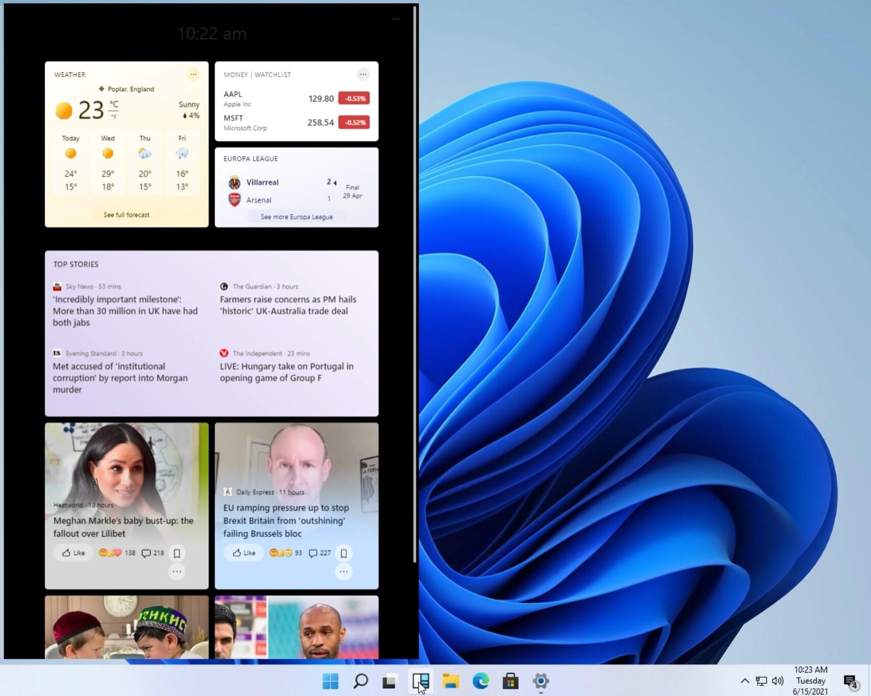
Alleged screenshots of Microsoft's upcoming operating system, the Windows 11, were leaked to the web ahead of its June 24 unveiling. The screenshots reveal a user interface that has several tie-ins with the current Windows 10, although enough is there to set it apart. For starters, the Start "menu" (if you can call it that), looks less like a menu, and more like a pop-out window with icons and actions, much like the macOS Finder. Icons pinned to the taskbar or open, are centered. The clock and system tray is still where it should be.

Windows Explorer features a familiar ribbon-type user interface, although there are changes to the icons. It's laid out exactly like in Windows 10. A thing to notice here is the window theme itself, which is single-tone, and with rounded edges. The "News and Interests" menu that surfaced in the recent Windows 10 update is more full-featured. User interface is only a fraction of what makes up a Windows major version, and Windows 11 is said to feature major under-the-hood changes, such as a new scheduler that's better suited for the upcoming hybrid x86 core processors from Intel and AMD.
Source: The Verge
Add your own comment

243 Comments on Windows 11 ISO Leaks to the Web, New Start Screen, Mac-like Centered Dock, Rounded Edges

#76
claes
Gotta say as someone who has actually used Macs this doesn’t really resemble MacOS at all IMO :head scratch:

looks kinda like gnome to me but really I just see Windows 10 with some modern ux elements :shrug:

@btarunr the start menu looks like Finder? Really? :wtf:

Posted on Reply
#77
Ja.KooLit
guys. It can be activated with windows 10 key :) I have tried logging with my old M$ acct, then I used my windows 10 keys to activate :)

Did a short video. Taskbar can be changed so it will look like windows 10 and not Mac look

Posted on Reply
#78
ThrashZone
Hi,
At least the wallpaper is different lol
Posted on Reply
#79
johnp
night.foxguys. It can be activated with windows 10 key :) I have tried logging with my old M$ acct, then I used my windows 10 keys to activate :)

Did a short video. Taskbar can be changed so it will look like windows 10 and not Mac look

Great video, thank you. I have not activated it myself, because the leaked version may contain malware and steal my product key.

So, I can not test the various themes, etc. Nice video.
Posted on Reply
#80
Ja.KooLit
johnpaGreat video, thank you. I have not activated it myself, because the leaked version may contain malware and steal my product key.

So, I can not test the various themes, etc. Nice video.
thanks. Well i dont mind if key will be stolen or ms block my acct. its an old one and extra key anyway (bought in ebay long time back for 2 dollars wahaha)
Posted on Reply
#81
XiGMAKiD
From what I've seen so far not great not terrible, there's a progress that could go to a good direction that's not traditional like 7, not crippled like Windows 8, not an abomination like 10. Looking forward to 2025.
Posted on Reply
#82
Wirko
Of all the things that MS shoved into Windows UI after 2001, Live Tiles are one of the most benign, and none of them keeps coming back after you've removed them, as far as I know. Weather is almost useful - computer users typically have their window shades closed, or have their operations room in the basement, and how else could they check the weather right here, right now?
Posted on Reply
#83
Athlonite
Well that's just fuckin ugly and that centered shit can fuck right off no thanks I don't run windows on a Tablet so don't be givin me that god awful tablet type look on the desktop that shit can fuck right off and when it's far enough away it can fuck off some more
Posted on Reply
#85
Dyatlov A
Microsoft, do instead a service pack for Windows 7 and everybody will be happy!
Posted on Reply
#86
medi01
Gruffalo.SoldierI think crapple will spit chips. Looks very very like their OS.
Looks nearly identical to Win 10 to me, bar centering of the start/buttons (which is a matter of taste, my start button is in the top right corner and in general "status bar" is better on the side when working on wide screens, but again a matter of taste)
Posted on Reply
#87
Wirko
m2geekPeople have been asking to centre the icons on the taskbar for a long ass time now, there is even apps to do it on the Appstore because it's more eye-pleasing and workflow friendly - Especially on ultrawide displays.
This might be a good idea if the execution was right. The start button is now a moving target, if you open several applications in succession from the start menu, the button will move to the left each time. In Mac OS High Sierra for example, the boundaries of Dock were still easily visible (but gradually disappeared over the years). Finding the left edge of Dock was easier because you had a visual cue. Microsoft didn't even try to copy the good part - there's no boundary at all between the Start button and the empty part of the taskbar.

Parts of desktop (or parts of a window) that serve different functions should be easy to distinguish visually, that's something that Microsoft was well aware of until ~2009, and less and less afterwards.

Then again, if you click to the left of the Start button, what happens? Do you get the menu anyway?
Posted on Reply
#88
Candor
Well after a quick whip around the os....it's fine I guess? It's like 10 and Vista had a baby.

I don't really care for the new icons or the new start menu but I'll get used to it. Move the start button to the left and yawn.

I'm not really concerned with wallpapers or sounds, they can be changed after all so whatever.

It is quite linux like which I think is what they're going for as further linux integration is coming.

I do use a tablet a lot, so the increased spacing of files in windows is appreciated for finger tapping.

It looks like widgets are back on the menu with "Windows Dashboard". I use rainmeter anyway, but thanks?

Lots of stuff I didn't ask for or greatly care about.
Posted on Reply
#89
shk021051
I like it but i care more about performance and new features
Posted on Reply
#90
Mussels
Freshwater Moderator
CandorWell after a quick whip around the os....it's fine I guess? It's like 10 and Vista had a baby.

I don't really care for the new icons or the new start menu but I'll get used to it. Move the start button to the left and yawn.

I'm not really concerned with wallpapers or sounds, they can be changed after all so whatever.

It is quite linux like which I think is what they're going for as further linux integration is coming.

I do use a tablet a lot, so the increased spacing of files in windows is appreciated for finger tapping.

It looks like widgets are back on the menu with "Windows Dashboard". I use rainmeter anyway, but thanks?

Lots of stuff I didn't ask for or greatly care about.
whats background RAM usage like at idle?
Posted on Reply
#91
Candor
Musselswhats background RAM usage like at idle?
Running in a VM, it's at about 1.3 to 1.6GB memory usage at idle (next to no programs installed).
Posted on Reply
#92
johnp
Musselswhats background RAM usage like at idle?
I have installed both Windows 10 and Windows 11 in VirtualBox, they both use 2GB of RAM when idle, with no programs running.
Posted on Reply
#93
claes
Will vary with system specs
Posted on Reply
#94
Mussels
Freshwater Moderator
I was just holding out hope that they debloated W11, is all

less background processes, smaller install footprint or whatever... Win 11 being "windows 10 without the garbage" would make it popular, fast
Posted on Reply
#95
Candor
MusselsI was just holding out hope that they debloated W11, is all

less background processes, smaller install footprint or whatever... Win 11 being "windows 10 without the garbage" would make it popular, fast
Yeah I don't see that as a major focus for them at the moment.

I only see windows becoming increasingly more touch-centric. More moving of stuff from control panel into the settings app until c-p is gone altogether.

And probably more mobile app and linux integrations.
Posted on Reply
#96
Marshal_90
It looks horrible!

There is no relation between those ugly folder Icons and the whole OS.

Windows 10X's start menu is not good for desktop PCs, It's difficult to find apps by their Icons. Windows 10 start menu is the best so far.

Icons on the center of the taskbar? What a stupid move. You kinda have to aim for the Start key!

The name is so weird. Windows 11?! Are we living in 2011? Windows 10 was so much cleaner and elegant. If they're tired of Windows 10 just rename it to Windows...

So far I'm so disappointed
Posted on Reply
#97
neatfeatguy
silentbogoThose new icons look like my first attempts at SVG pictograms in Inkscape... Current set is at least passable, I hope they'll leave the option to switch back.
OSXy taskbar is a good thing. I've been using something like this on Ubuntu and older versions of Windows(since XP), but ended up being too lazy to find a solution to realign my app buttons in W10.
The rest - don't care about and will likely disable. Can't even stand their new weather widget near system tray, which requires you to sign in with MS account in order to change locale and location.

That's what I thought before, but given their recent history I think Nokia destroyed Nokia. Their refreshed smartphone business was promising, but formally lasted a year with one product lineup cycle. No proper flagships since my Nokia 8, no OLED models, not a hint of "legendary reliability"... everything is sub-mediocre and overpriced, even feature phones.
I hate the taskbar look. I hate giant clutter on the screen. What good are bunch of stupid icons that just litter the work space?

I hate the "Type here to search" spot on the task bar on Windows 10. It takes up unnecessary space. But if you hide the search bar it doesn't show up when pressing the Windows Key, like it did under Windows 7.....so you have no quick way to search for programs.

I just like, simple, clean looking and easy to navigate without having a ton of giant images/icons shoved in your face. At times I like to navigate with just the keyboard and even times when I know exactly where a file/program is I need I might launch it from the command prompt instead of clicking my way through half a dozen folders. When I first loaded and used Windows 10 it looked like and felt like someone threw up in the start menu....so cluttered with pinned crap it almost made my eyes bleed. That's about the same way I feel when I see my wife boot up her Mac laptop....giant icons at the bottom, her desktop screen cluttered....I even asked her if she uses all those programs along the taskbar at the bottom and she told me that she doesn't and she also doesn't even know what a few of them are, but just leaves them there.
Posted on Reply
#98
Wirko
MarkoszAbsolutely disgusting rounded crap with tons of mobile elements.
MS is absolute shameless liars, they said Win 10 would be the last.
You can make Win 10 the last one for you - in which case, MS didn't lie to you.
Posted on Reply
#99
micropage7
TheEndIsNearDammit if they are going to make it like a Mac I'm going to Linux
and it happened again, when M$ like want to follow the other coz of the looks, M$ like never learn from Windows phone that following android and IOS
now they look like following apple, although they have their own character
FouquinSo. Much. Padding.

Every icon is a million miles apart and you can't tighten the grid. Just wasting screen space for the hell of it.

yeah wasting space and looks like filling the space is a new trend for M$, suddenly i miss the old school layout than this one
Posted on Reply
#100
Blueberries
Weird how these leaks happen every generation and always just before the official launch
MusselsI was just holding out hope that they debloated W11, is all

less background processes, smaller install footprint or whatever... Win 11 being "windows 10 without the garbage" would make it popular, fast
I can't wait to find the 50 new registry keys I need to change in this build /s
Posted on Reply
Add your own comment
Feb 17th, 2025 19:26 EST change timezone

New Forum Posts

Popular Reviews

Controversial News Posts