Thursday, July 2nd 2020

Microsoft Gives Windows 10 Start Menu an Overhaul
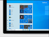
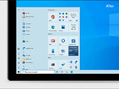
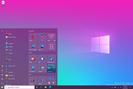
Microsoft is giving the Windows 10 OS some finishing touches still, as a lot of UI is slowly changing over time. For example, just a few months back we have received a new icon pack that brought the material design to Windows 10 icons. However, now Microsoft is going even further in its mission to blend UI elements and give users the best possible viewing pleasure. This time, Microsoft is giving the start menu an overhaul. "We are freshening up the Start menu with a more streamlined design that removes the solid color backplates behind the logos in the apps list and applies a uniform, partially transparent background to the tiles. This design creates a beautiful stage for your apps, especially the Fluent Design icons for Office and Microsoft Edge, as well as the redesigned icons for built-in apps like Calculator, Mail, and Calendar that we started rolling out earlier this year."
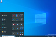
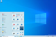
It is available in Windows 10 Insider Preview Build 20161 and should come to mainstream later on. If you want to splash a bit of color (see images below) you can apply that theme by going to Settings > Personalization > Color, then toggle the "Show accent color on the following surfaces" for "Start, taskbar, and action center". Below, you can check before and after comparison between old and new designs, along with the new color theme.
Source:
Microsoft Blog
It is available in Windows 10 Insider Preview Build 20161 and should come to mainstream later on. If you want to splash a bit of color (see images below) you can apply that theme by going to Settings > Personalization > Color, then toggle the "Show accent color on the following surfaces" for "Start, taskbar, and action center". Below, you can check before and after comparison between old and new designs, along with the new color theme.
53 Comments on Microsoft Gives Windows 10 Start Menu an Overhaul
Its like, they intentionally break it so they can fix things again. The same goes for Windows Settings. Window after window of redirection into yet another window with minimal information density. How is this better than having everything together in one Window with tabs like the old days? Irony, if you dig too deep into advanced settings you DO end up in that good old window with tabs to discover it was all in one place to begin with :twitch:
This start menu and its woes... yes. I recognize them. The color picker they offer was horrible to begin with. Another mind blowing thing is how they arrange those tiles and how the drag and drop works technically. You can barely see what you're doing until its too late and the whole tile space has been rearranged to 'fit' whatever you are dragging. Give me a clear outline or something... its not hard, its been done about 1814812931480 times before, MS.
to this
people would be "omg, where is my candy crush?"
Seriously, though, I saw the headline and my first thought was "Oh, Microsoft, what the heck did you do now?!"
True Story.
It gives you customisation options for the Windows 10 start menu, so you can have it pretty much however you want. For me, it's an essential (and very cheap) program for any Windows 10 installation, due to increasing useability.
I can't go into personalization tho,cause reasons.
The irony is that the system settings allow you to hide the apps, but not the tiles . We already have our phone to check the weather/news, even Apple decided to kill the dashboard and their widgets, the user is the one deciding weither or not they want to have third party widget in the notification center.
Pinned apps in the start menu are overlapping with pinned apps in the task bar. The new icons are nice though.
Quit whinging, Windows has always allowed easy customisation, and if stock UI settings are whats keeping you on an 11 year old OS, then maybe question your status as a techie.
But yeah, I don't use a lot of programs to being with, there's room for at least 40 of them on a 1080 screen, and other rarely programs I open from Start or Explorer.
So do you lads and gents like the windows 10 start menu or something more precise more lite
Sometimes you can type "control panel" and get Bing web results for Control panel rather than the actual control panel.
Sometimes it works for modernUI app subsections like Activation or Themes, sometimes it just claims no matches.
For power users that know the Win+R command it's not a big deal, but for your average user it's a frickin' disaster. I've seen total start-menu meltdown on fresh installs from ISO, and vendor pre-installed windows from Lenovo and Asus alike.
Although thankfully that happens a lot less now than when Windows 10 launched.
Mgmt: So what can we do to create a lot of buzz that doesn’t take much effort?
Bob: Well.. We haven’t f’d with the start menu in a while?
Mgmt: Brilliant! Give that man a raise from the QA layoffs pool.
If it aint broke...
then break it, like, yesterday...
Then we can release an update and claim we made it moar betta, hahahahahahaha !
Either way, I am not worrying about Microsoft’s UI and start menu changes.